HIVE INDEX — Honey Treated Like Evidence
 Click to enlarge ↗
LOGLINE
 Click to enlarge ↗
A raw honey brand that refused to be cute about it. Instead of flavor names and rustic jars, I built a system where every batch gets a specimen number, a harvest date, and tasting notes written the week it was pulled — because raw honey isn't a product, it's a report from a season.
THE BRIEF
 Click to enlarge ↗
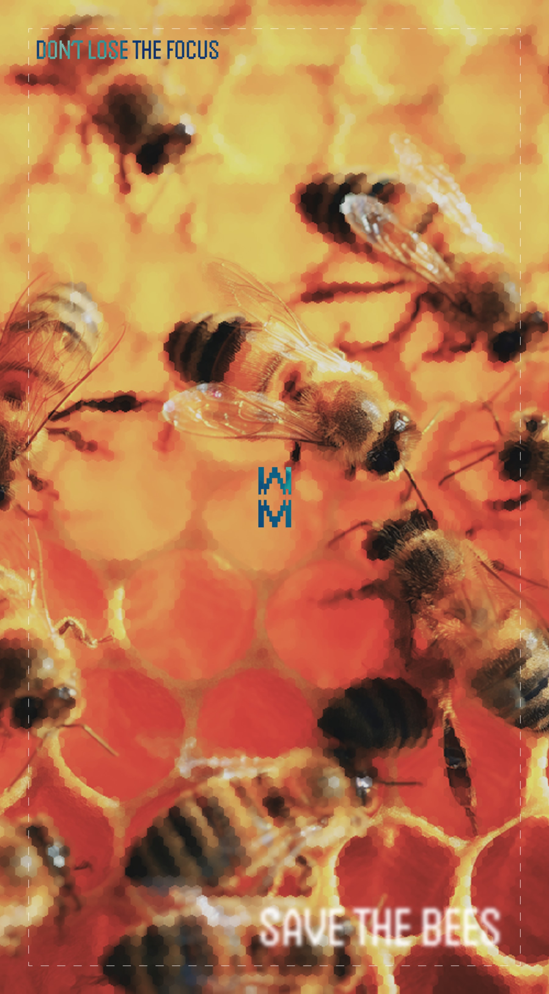
I picked this one deliberately. Looking back at my own portfolio, I noticed I'd built a lot of fashion, beauty, cannabis, and beverage brands — and almost nothing rooted in a genuinely unglamorous, overlooked industry. Raw honey was exactly that gap. Every honey brand I looked at reached for the same three moves: cursive script, a cartoon bee, and a "golden hour" glow. None of it was honest about what raw honey actually is — a substance that changes every single harvest depending on weather, bloom, and forage radius.
The tension was simple: how do you brand something that's inherently inconsistent without pretending it's consistent? Most honey brands solve this by blending batches until every jar tastes identical. I didn't want to solve it. I wanted to document it.
What I took on was the full system — identity, packaging, OOH, retail and social applications, and a website — built around one governing idea: treat honey like a field specimen, not a flavor.
THE APPROACH
 Click to enlarge ↗
My first instinct was to lean into naturalist illustration — pinned-specimen line drawings, the kind you'd see in an old field guide. It looked good in isolation, but it fought the brand's core premise. Illustration implies interpretation. I needed something that read as recorded, not designed.
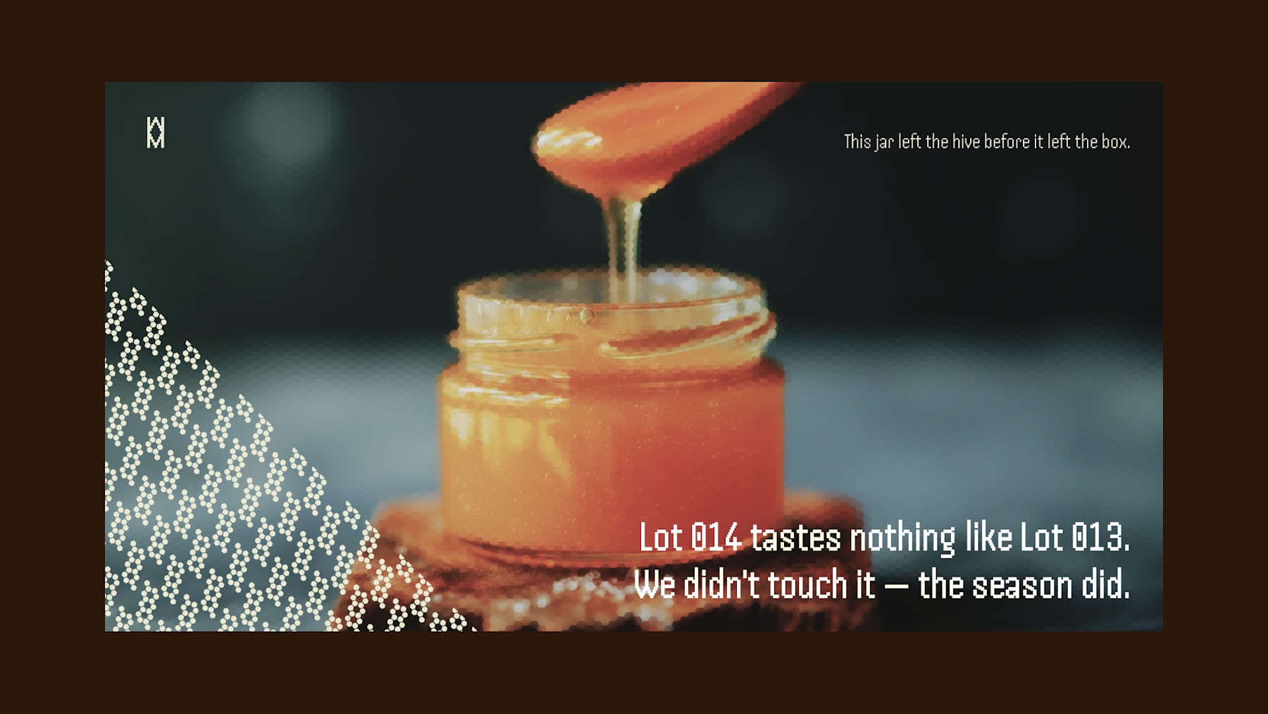
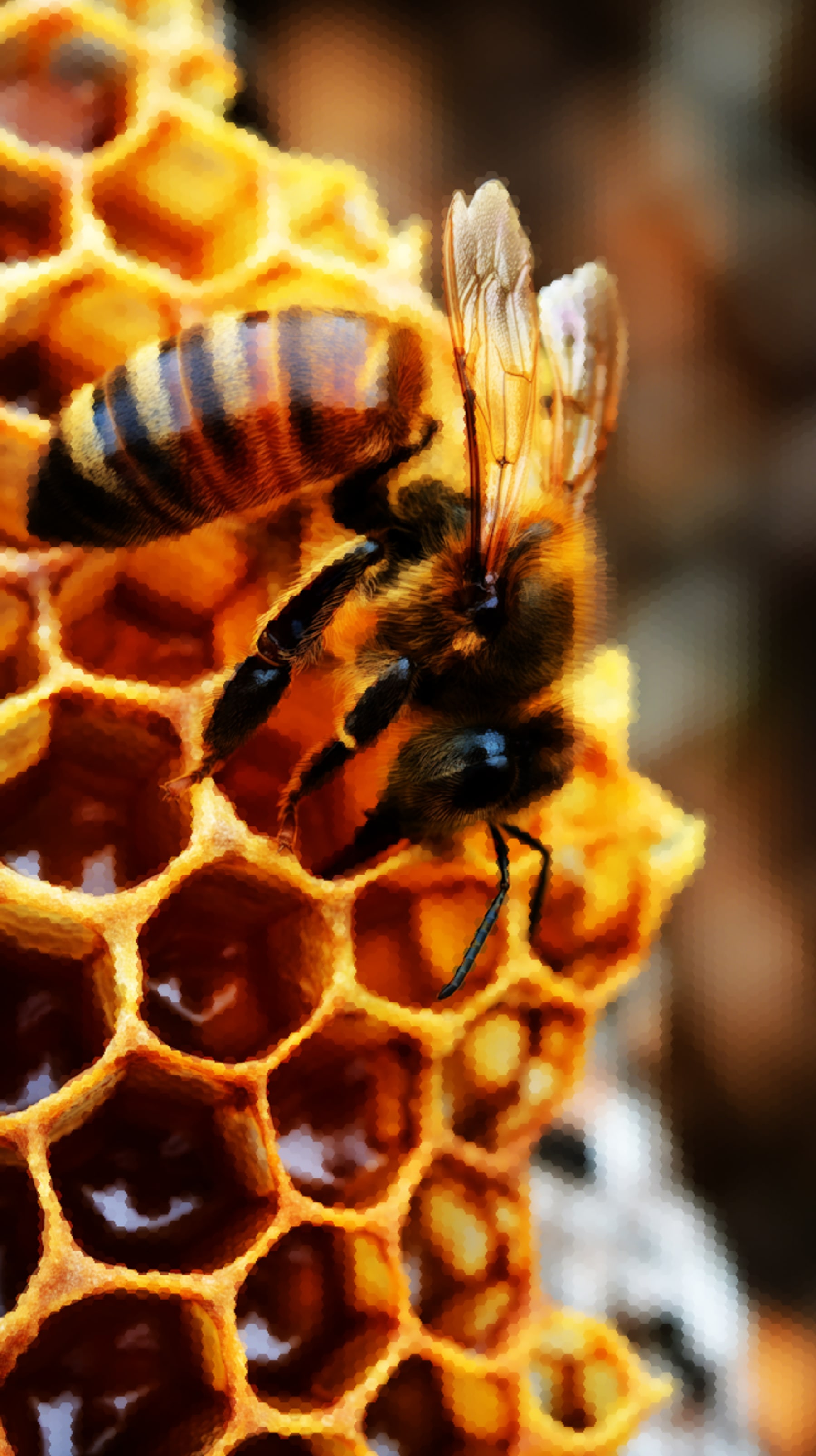
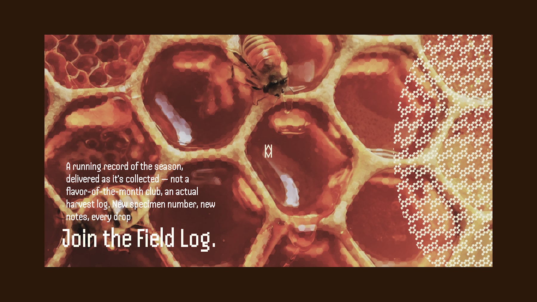
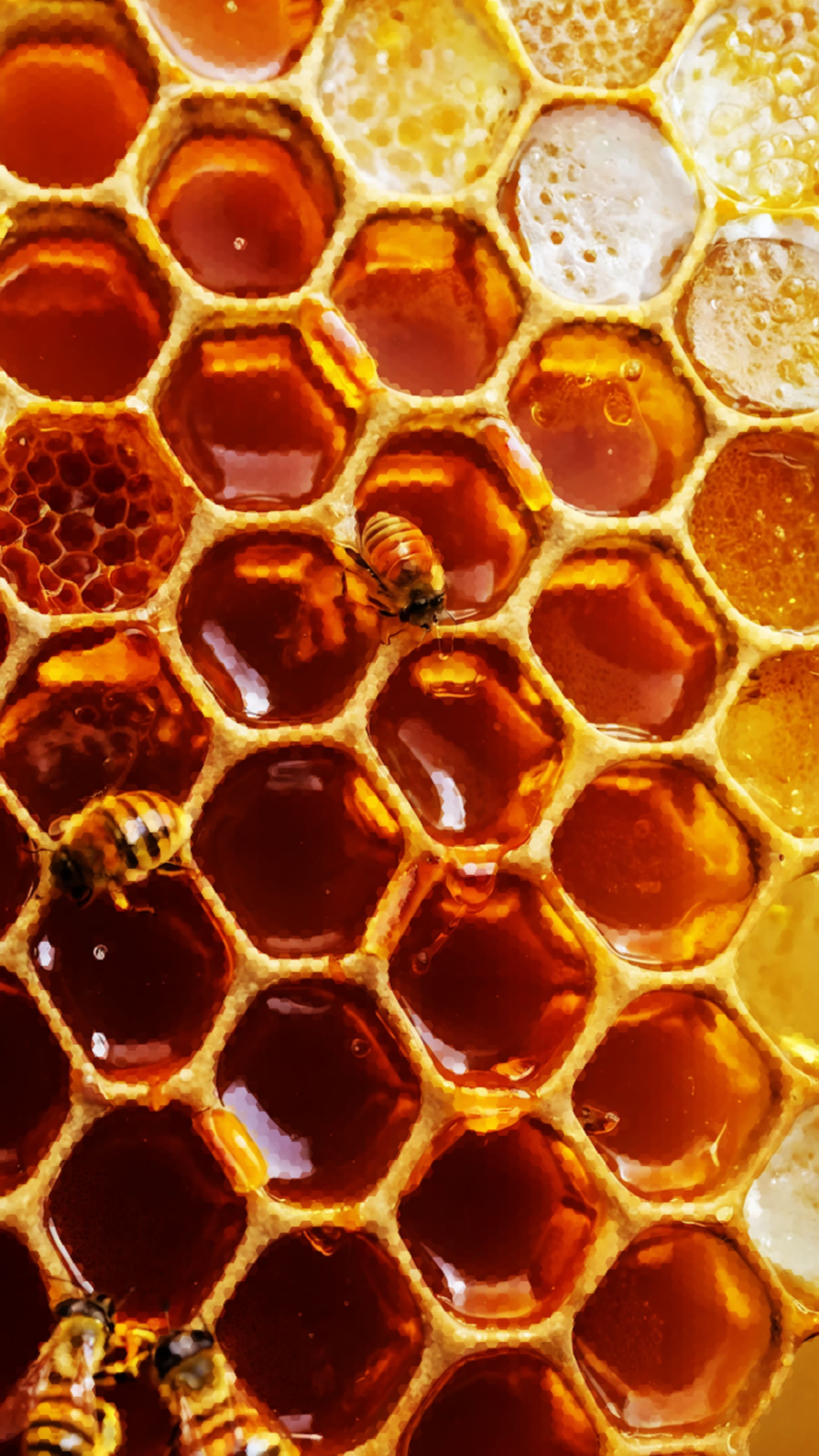
That's when I dropped the illustration entirely and rebuilt the system around real photography and real data. Instead of decorative bee drawings, I used actual macro photography — pulled low-contrast and desaturated, so the honey reads closer to clay and rust than glossy gold. Instead of an illustrated hex pattern, I used a literal dot-matrix hex texture, treated as a graphic device bleeding in from image edges rather than a cute honeycomb motif.
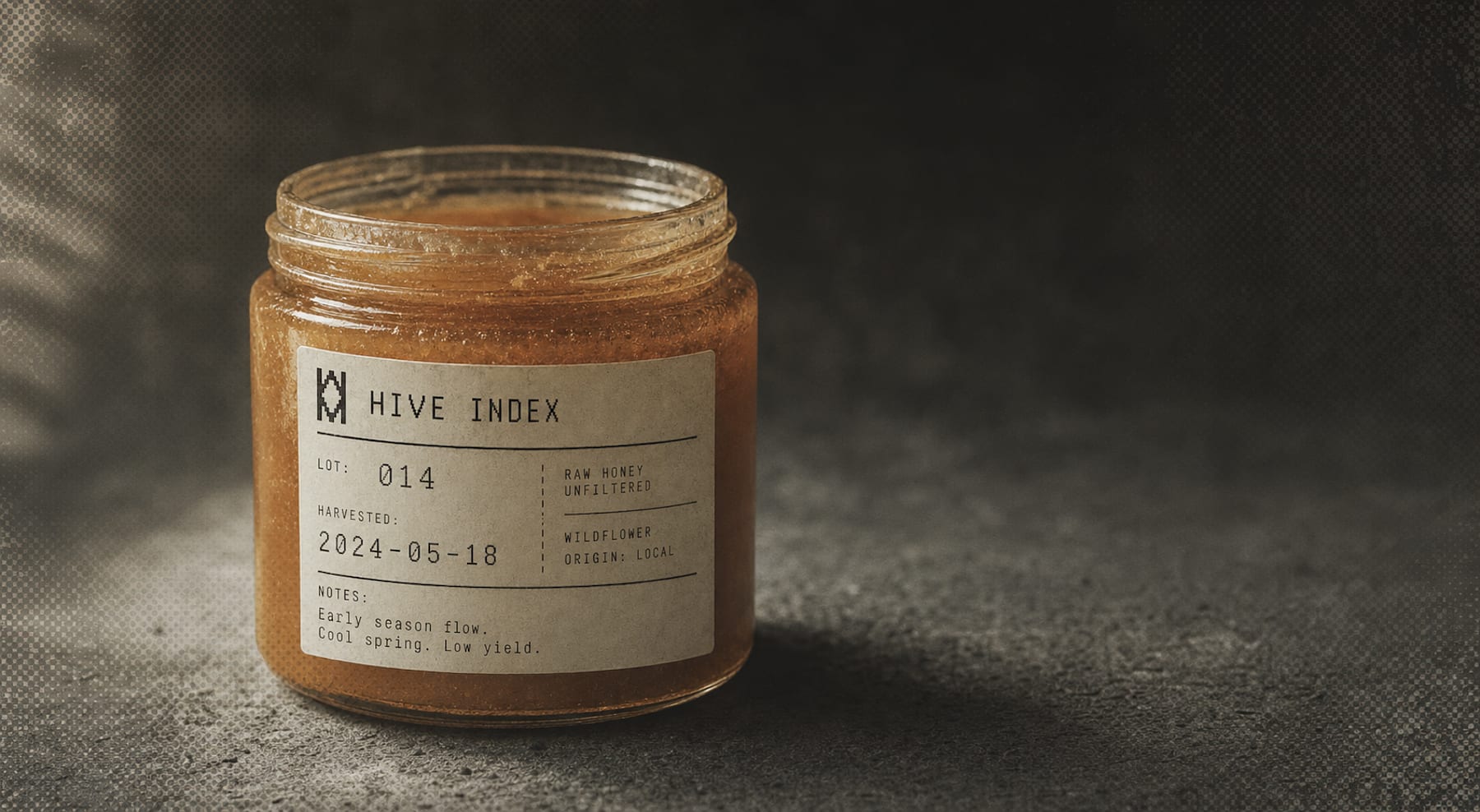
The specimen-card format was the unlock. Once I decided every product page, every label, every OOH placement would carry a specimen number, harvest date, and tasting note — the same way a lab intake form or a museum catalog card works — the rest of the system built itself. The dashed border framing device came directly from that logic: it's not decoration, it's an evidence-card crop mark. Even the copywriting followed the rule — "Lot 014 tastes nothing like Lot 013. We didn't touch it — the season did" became the thesis statement for the entire brand.
The logo took longer to get right. My first version of the hex-glyph "H" mark looked clean in isolation but started dissolving into ambiguous geometry once placed on busy photography or scaled down to favicon size. I had to go back and test it in isolation at multiple sizes, stress-test it as a single-color stamp, and only then commit to a stroke weight that held up across both flat print applications and on-photo placements.
THE WORK
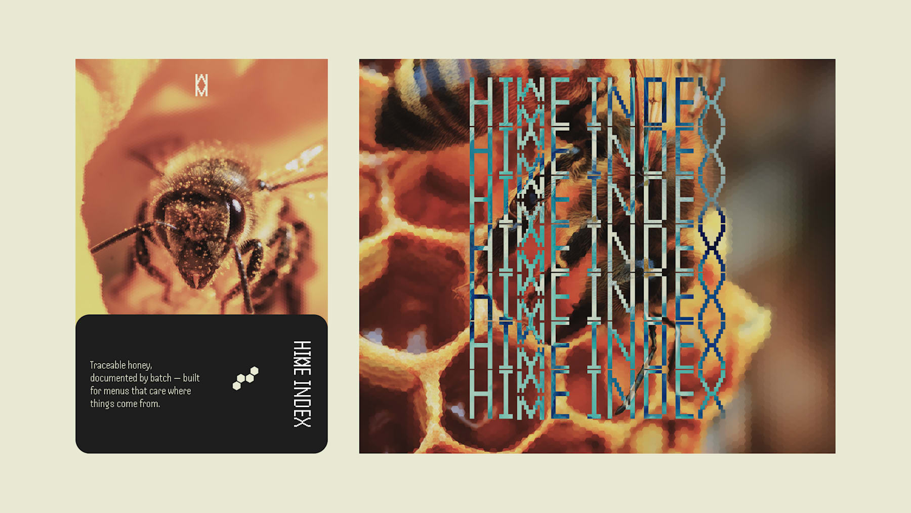
BRAND IDENTITY / VISUAL SYSTEM The full system runs on a single rule: document, don't decorate. Every touchpoint — packaging, signage, digital — carries some version of the specimen-card format: a numbered lot, a harvest date, an origin, and a tasting note, styled like lab documentation rather than marketing copy.
 Click to enlarge ↗
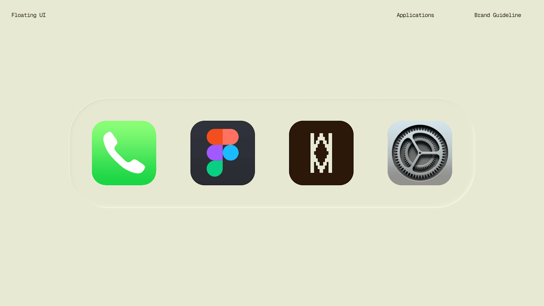
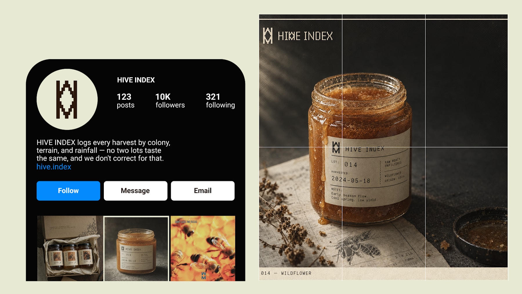
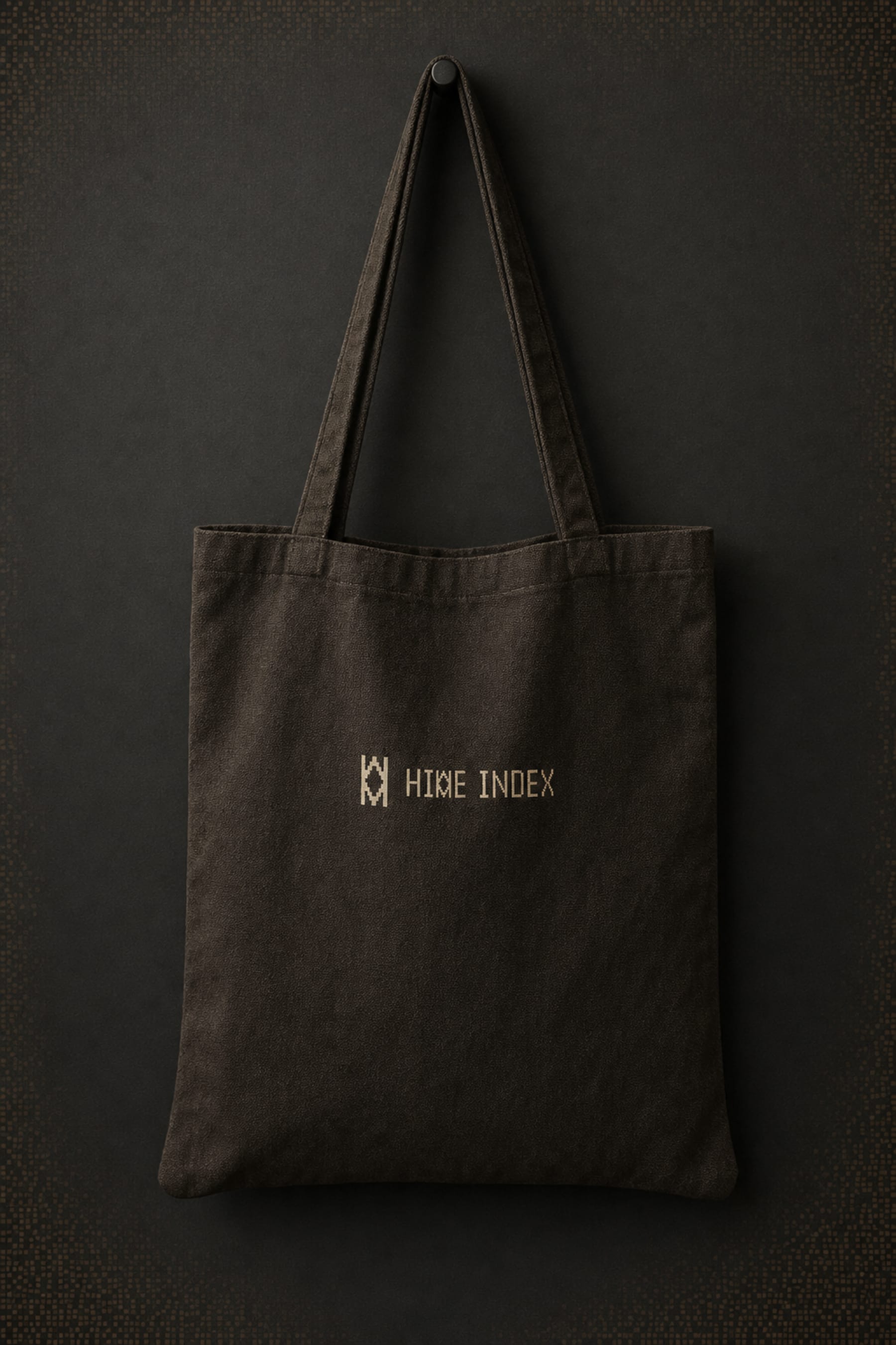
LOGO A hex-geometry glyph built to abstract an "H" from hexagonal structure rather than illustrate a bee or a comb. Refined for legibility at small sizes and tested as a single-color stamp/deboss, since so much of the brand lives in physical, tactile applications.
 Click to enlarge ↗
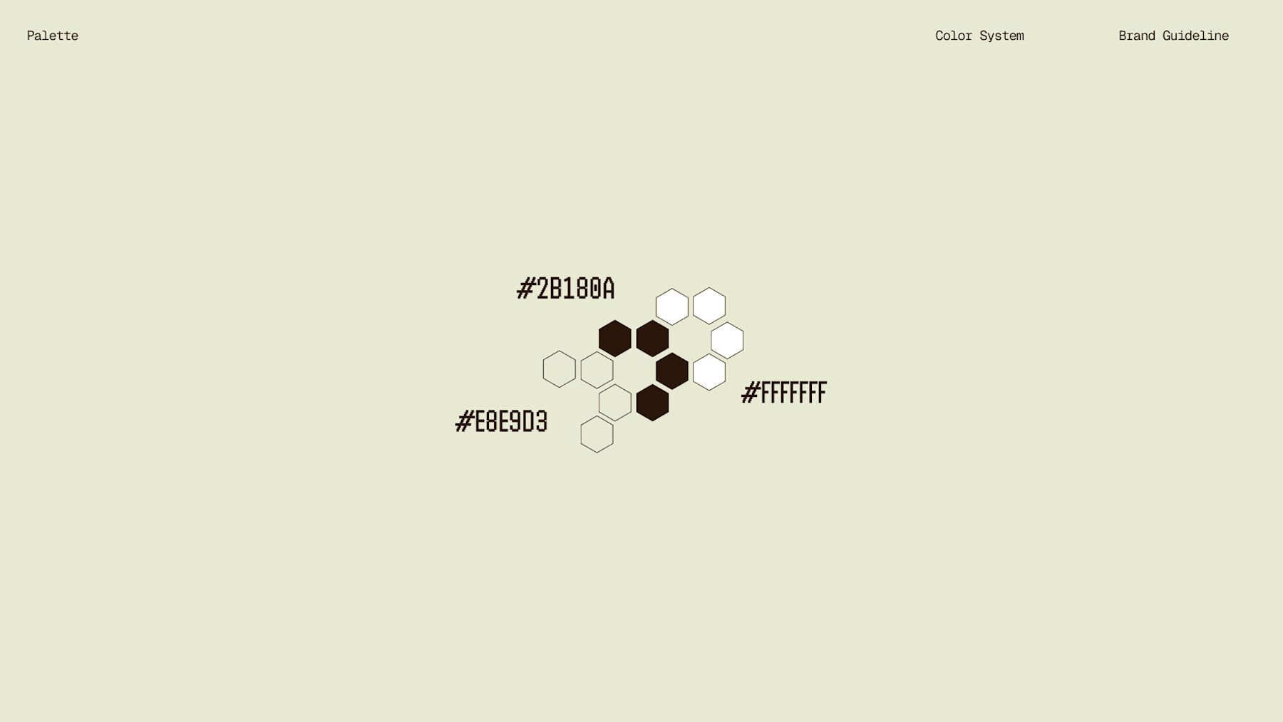
COLOR SYSTEM Graphite/near-black (#1A1410) and specimen paper cream (#EAE6D4) form the structural palette. Amber (#C8622A–#E8934A) is used only within photography — honey, comb, harvest imagery — never as a flat brand color, keeping the system from tipping into typical "warm honey brand" territory.
 Click to enlarge ↗
TYPOGRAPHY SYSTEM Monospace type carries all data — specimen numbers, harvest dates, lot notes — reinforcing the lab-report register. A humanist sans handles headlines and longer copy, keeping the system readable without breaking the technical mood.
 Click to enlarge ↗
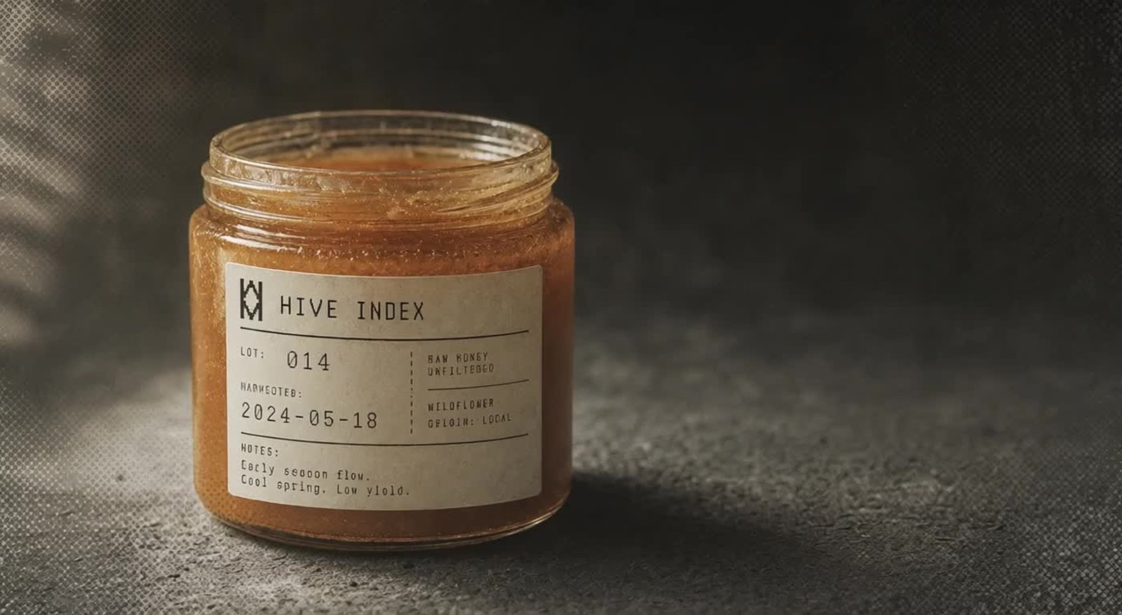
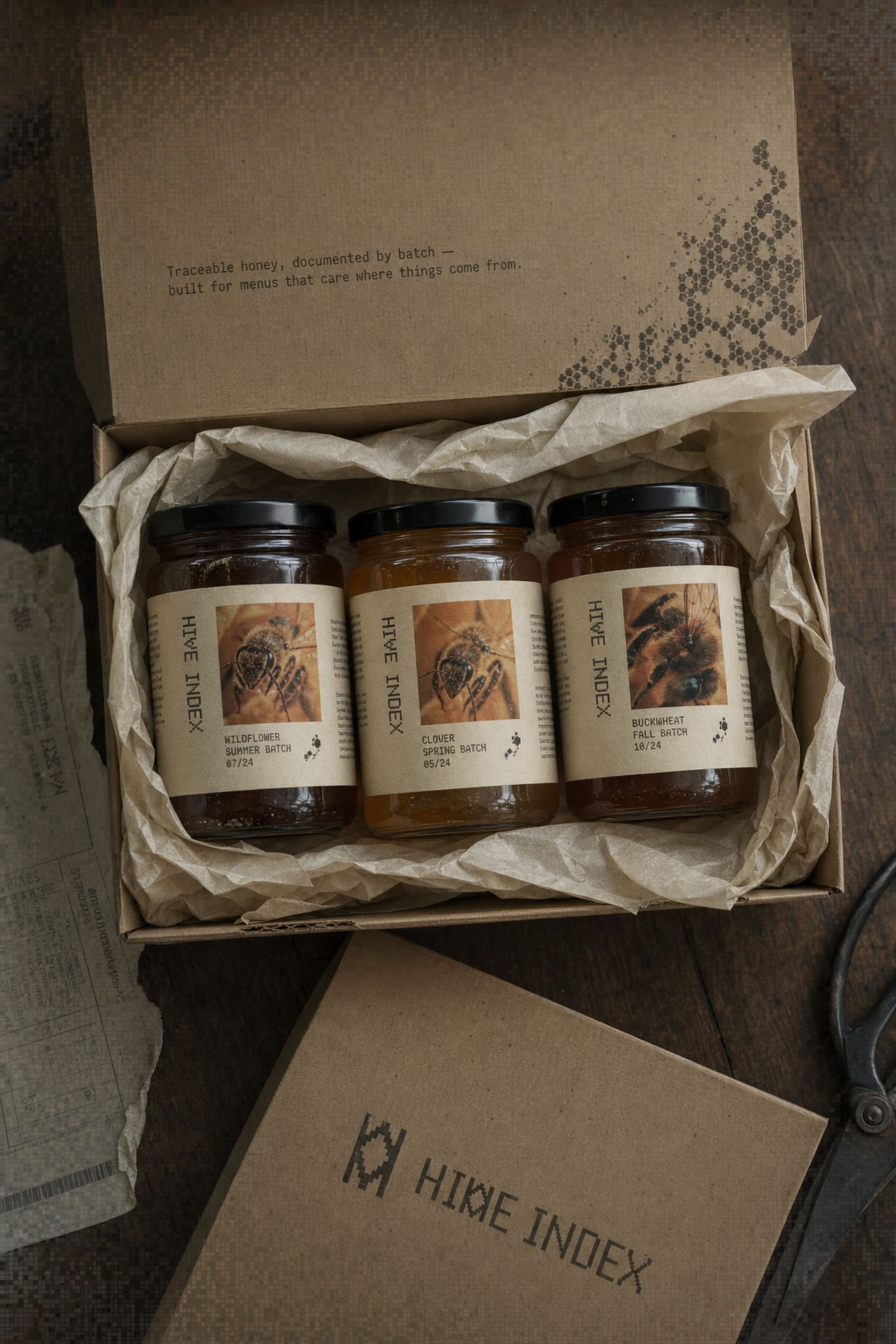
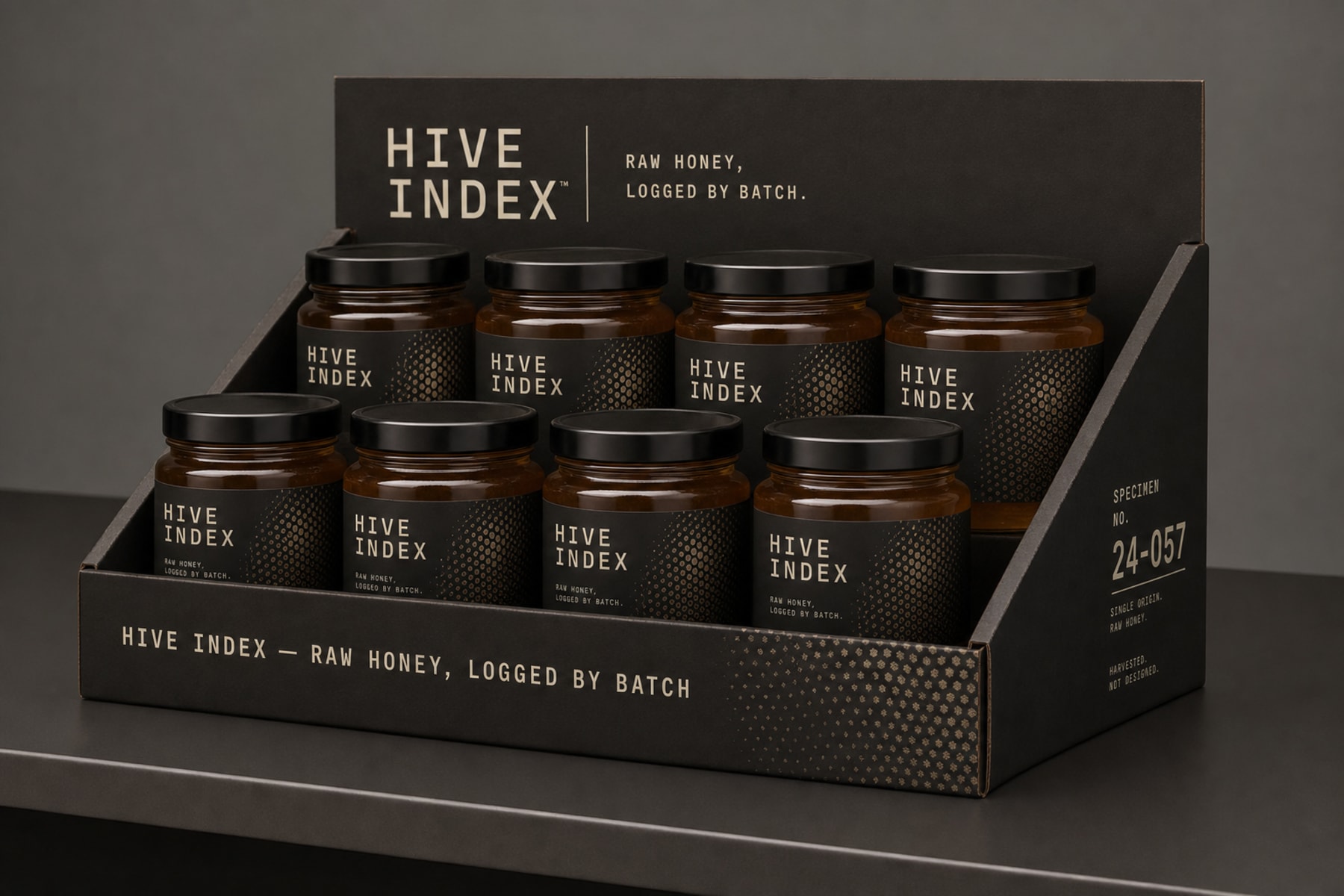
PACKAGING Jar labels formatted as specimen cards with lot number, harvest date, apiary origin, and tasting notes. Shipping cartons carry the same logic on the interior flap, with a hex dot-matrix texture bleeding from one corner and a stamped, single-color logo rather than a full-color print.
 Click to enlarge ↗
 Click to enlarge ↗
 Click to enlarge ↗
WEB DESIGN Built in Framer, structured around Specimens / Process / Field Log rather than a conventional product-grid ecommerce layout. The traceability section turns literal weather data — flowering window, rainfall reading — into on-page content, which is the clearest expression of the brand's whole premise: the season writes the copy, I just log it.
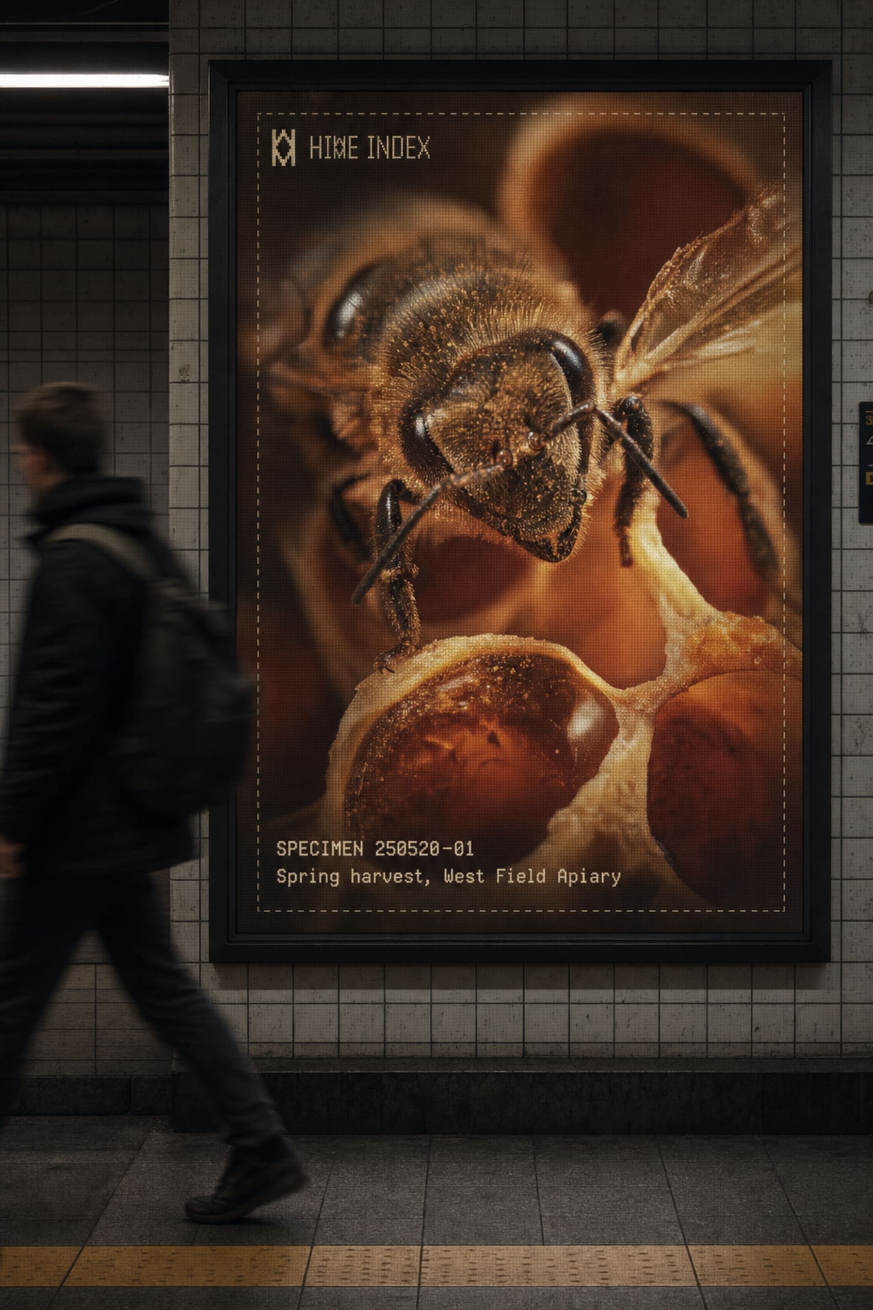
PRINT / OOH / ENVIRONMENTAL A subway platform poster treats the ad space like an evidence card, dashed border and all. Farmers market signage, storefront window decals, a retail shelf riser, and a delivery van wrap all carry the system at different scales, deliberately avoiding rustic market styling in favor of something closer to research documentation moved into public space.
 Click to enlarge ↗
 Click to enlarge ↗
THE RESULT
The system shipped across a genuinely wide range of touchpoints — packaging, environmental signage, transit advertising, social, and a live website — without the identity fracturing at any scale. The specimen-card logic proved flexible enough to hold up on a subway poster and on a jar label without feeling like two different brands.
 Click to enlarge ↗
The website is where the concept clicked hardest for me. Turning rainfall and flowering-window data into actual page content wasn't something I planned from the start — it came out of pushing the "document, don't decorate" rule as far as it would go. That's usually the sign a system is working: it starts generating its own content logic.
Révolté — revolte.designProject: Hive Index Year: 2026 Scope: Brand Identity, Logo Design, Packaging, Web Design, OOH, Environmental Design, Social Templates Industry: Food & Beverage — Specialty Apiary
 Click to enlarge ↗
See more at revolte.design