A hospitality group with a bakery, a lunch counter, a dining room and a late bar, sharing nothing but a standard. I gave the identity one punctuation mark and let the hour of the day change everything else.

Brand Identity & Digital Flagships
Every commission begins with a singular conceptual anchor. Case studies spanning physical packaging, tactile typography, and bespoke web platforms.

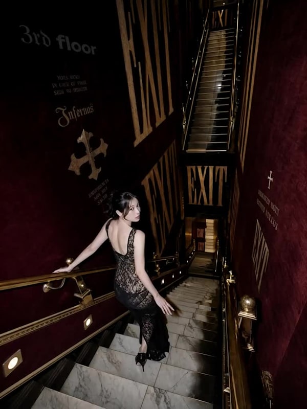
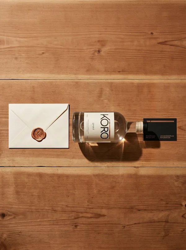
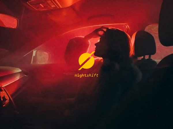
A hospitality group with a bakery, a lunch counter, a dining room and a late bar, sharing nothing but a standard. I gave the identity one punctuation mark and let the hour of the day change everything else.

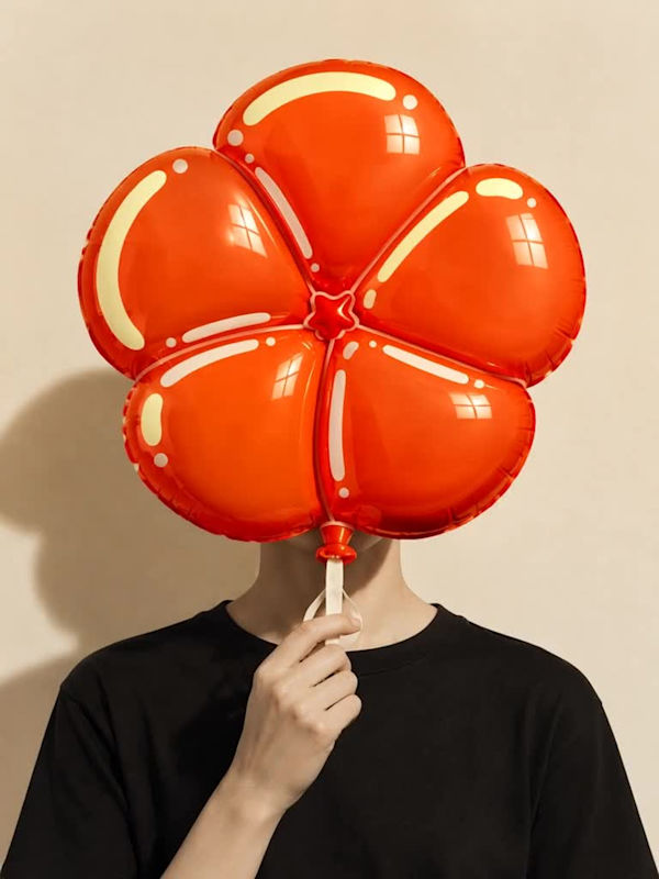
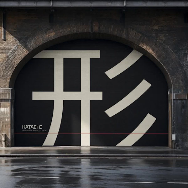
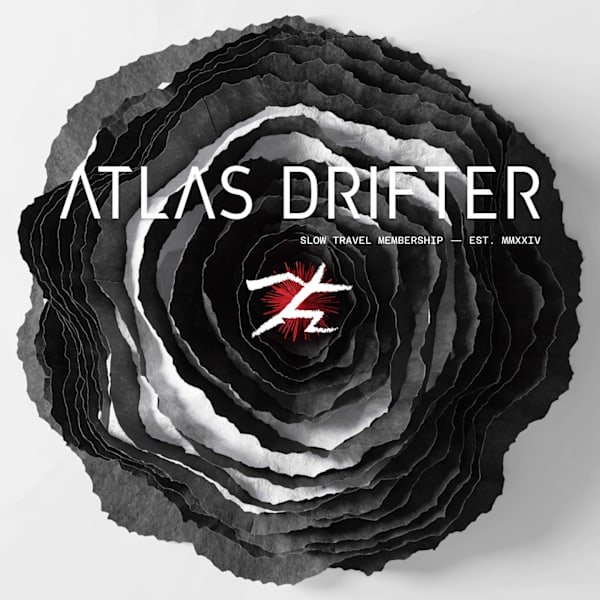
A subscription that mails one strange, staged object a month. It needed an identity as physical as the thing in the box, so I inflated the lettering until it filled the frame.

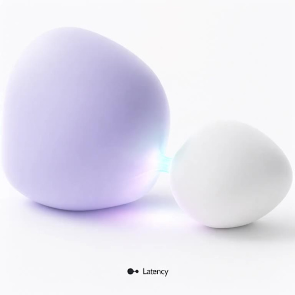
Every AI product treats the wait as a flaw to hide. I built a studio identity that treats it as the structure holding the whole interaction together.

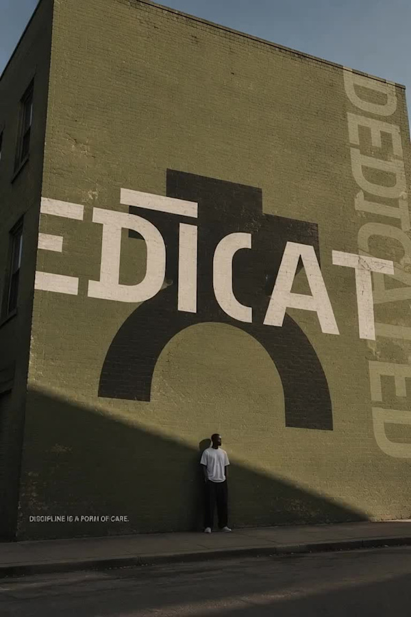
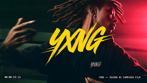
Training brands shout. I made one that holds still: a faceless figure, three flat colours and a single hard light, all arguing that discipline is a form of care.
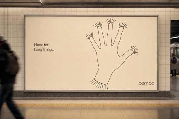
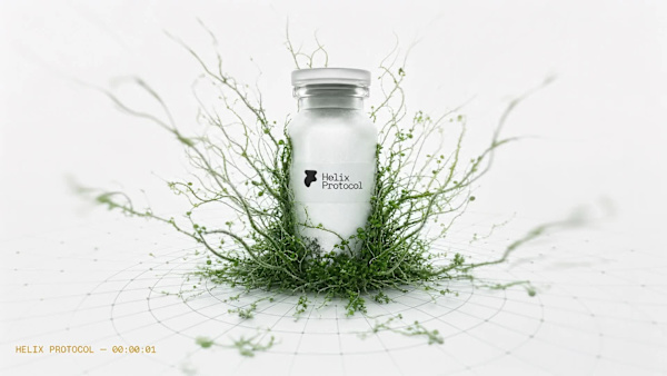
A pre-launch pet health brand needed to feel like something you'd hand a life to. Not a gadget. Not a clinic. The brand that emerged lives somewhere between a nature documentary and a precision instrument.

A standup tool whose whole promise is less meeting, which meant the brand had to feel like an absence. I built it around one gesture, slide to stand up, and kept everything else quiet around it.

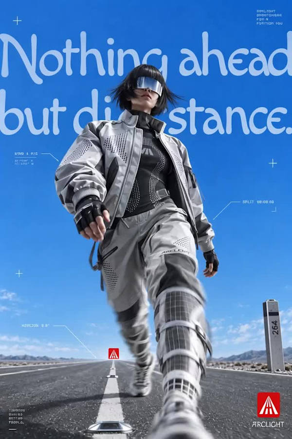
A sportswear brand built on a single mechanical idea: garments that read as quiet and grey until a flash or headlight hits them, then reveal reflective panels and dot-matrix body maps underneath. I built the identity, the campaign system…

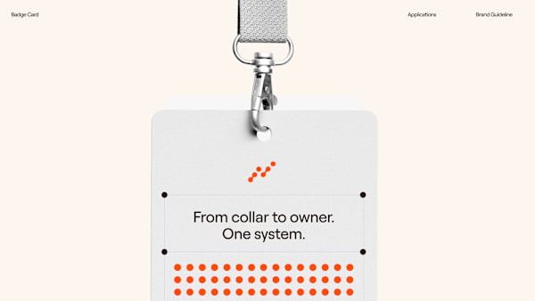
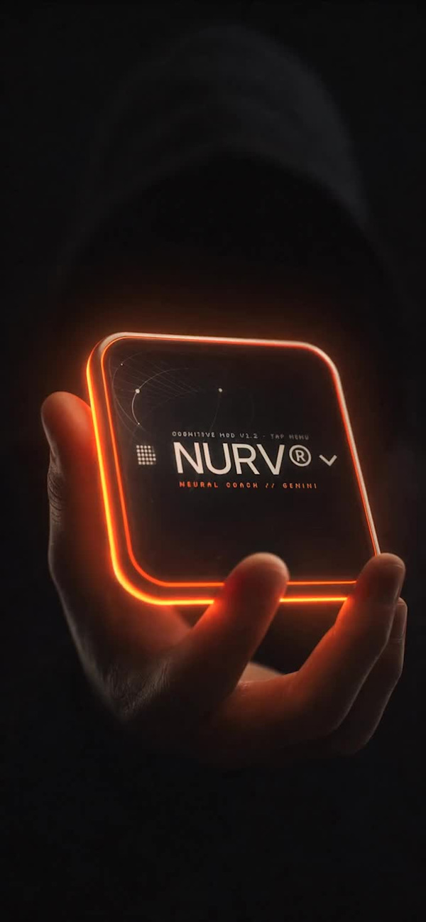
Fitness apps treat the body like a mood. I wanted one that treats it like a system worth instrumenting, so I gave swim, food and supplements a single language: nine dots and one orange.

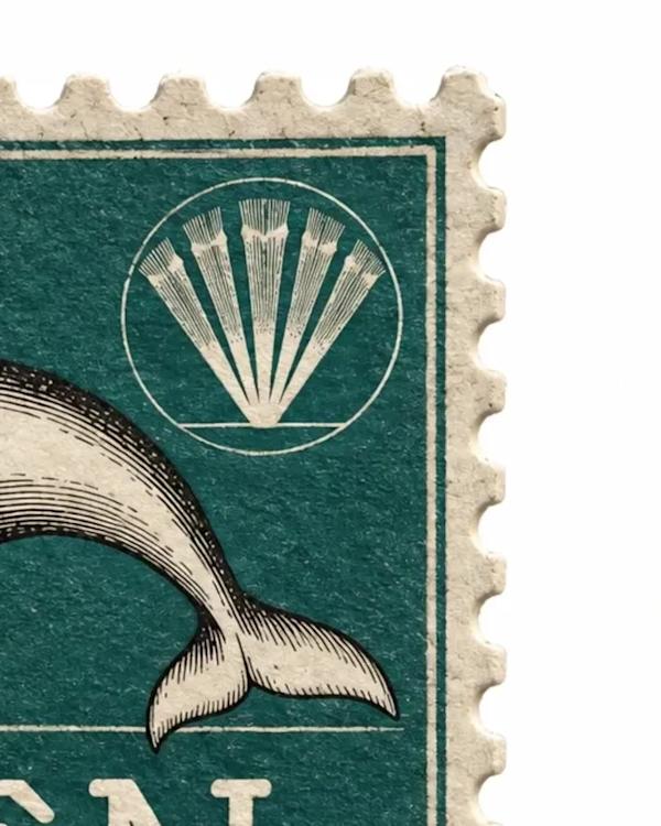
A marine salvage brand that treats a corroded ship's bell the same way a 1960s postage stamp treated a clownfish — catalogued, denominated, verified. I built the entire identity out of vintage natural-history stamps instead of treasure-h…

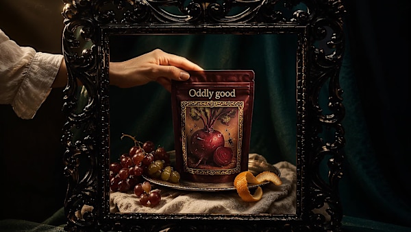
A snack brand for vegetables the supermarket rejects. Every pack is a Flemish oil painting you could swear you could touch.

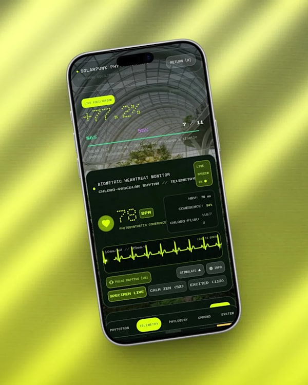
your steps = kinetic energy. your sleep = hydration turgor. your screen time = solar flux.
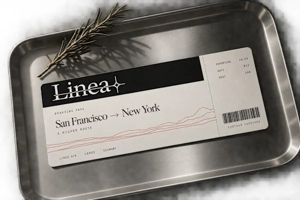
Every route has a shape. Most rail brands decorate over it. Linea traces it.
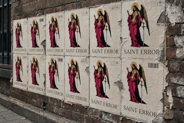
A zero-knowledge privacy protocol that treats identity the way a cathedral treats its effigies: carved into permanence, name worn off the stone. I built the whole system around one idea — verification without exposure — and let the visua…

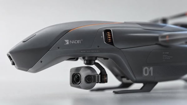
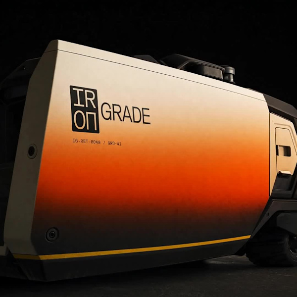
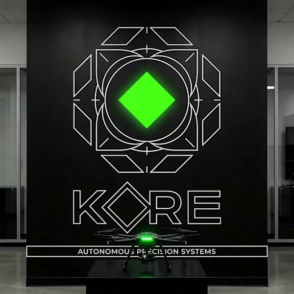
I needed to prove I could think in systems, not just make things look good. So I built a full aerial-hardware brand from a single logo mark — name, identity, product photography direction, and two working landing page specs — and let the…

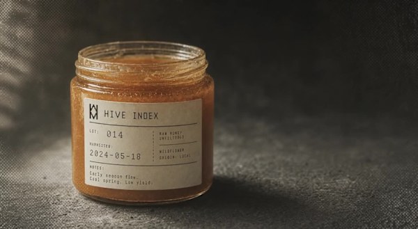
A raw honey brand that refused to be cute about it. Instead of flavor names and rustic jars, I built a system where every batch gets a specimen number, a harvest date, and tasting notes written the week it was pulled — because raw honey…
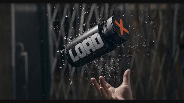
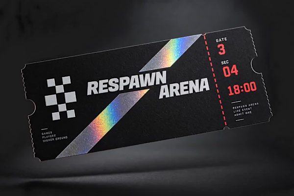
Esports outgrew the gaming café years ago. The venues never caught up. I built RESPAWN ARENA to close that gap — a brand for a physical competitive-gaming stadium that borrows its entire visual language from broadcast sports, not from ga…
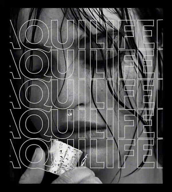
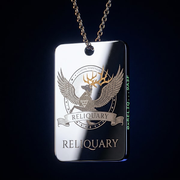
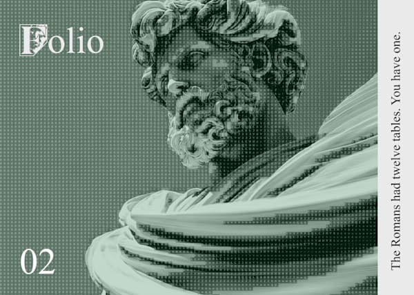
A jewelry brand built around a Roman military role — the aquilifer, the standard-bearer who carried the one thing the legion couldn't afford to drop. I built the entire visual system, photography, and motion language around that single i…

A data-infrastructure brand built on the idea that the oldest markings on earth and the newest systems we build both come down to the same instinct: reduce everything to one honest line.

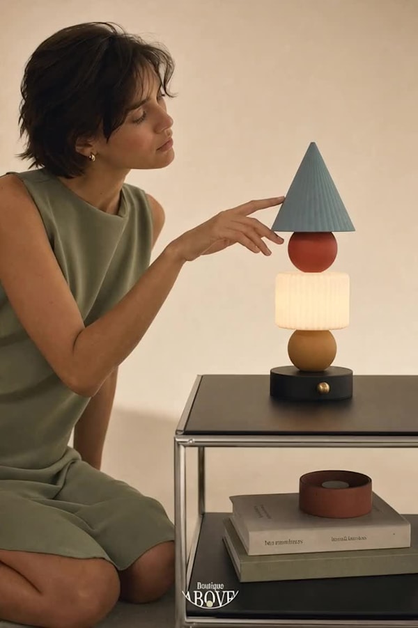
A postmodern lighting boutique that came to me with a mood board full of Memphis energy and asked for luxury. Those two words don't usually sit in the same sentence. I made them.

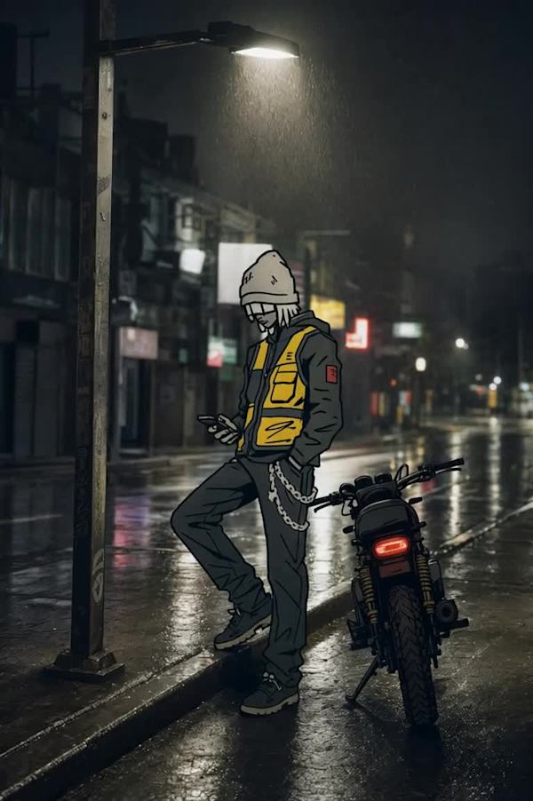
A courier brand that refuses to be invisible. Instead of stock photos of anonymous riders, I built Dockhand around a drawn cast — cel-shaded couriers stamped directly onto real, unglamorous city photography — and then took it all the way…

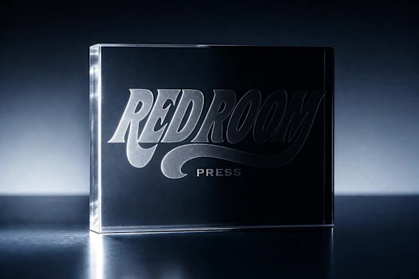
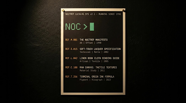
A publisher that treats every release like a stage set. I built a brand where each issue lives inside its own single-color room, lit once, hard, from one side — no white backgrounds, no lifestyle photography, ever.

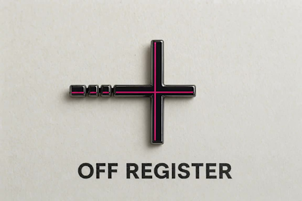
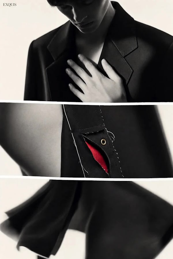
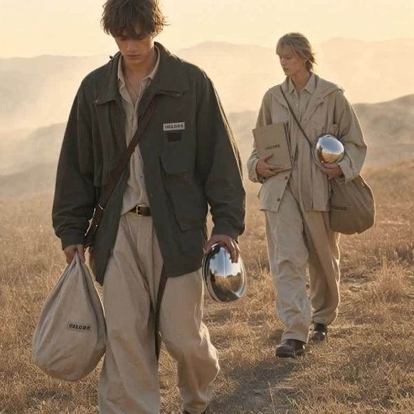
A fashion label with no interest in looking normal. I gave it a refined mark, three colors, and permission to make the clothes feel slightly wrong on purpose.

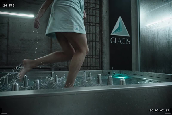
A cold immersion clinic for people who train hard, where the brand had to survive being looked at as coldly as the water inside it. I built a system with no comfort language and let the architecture do the talking.
An exploration of what a wellness brand looks like when its visual world is built entirely from the tells of AI-generated imagery — tiled assets, seamed color transitions, inconsistent shadows, scale that never quite resolves — while eve…

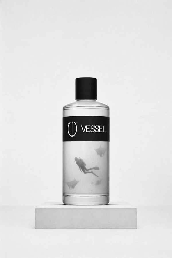
VESSEL,a brand built on the idea that water can be traced like evidence

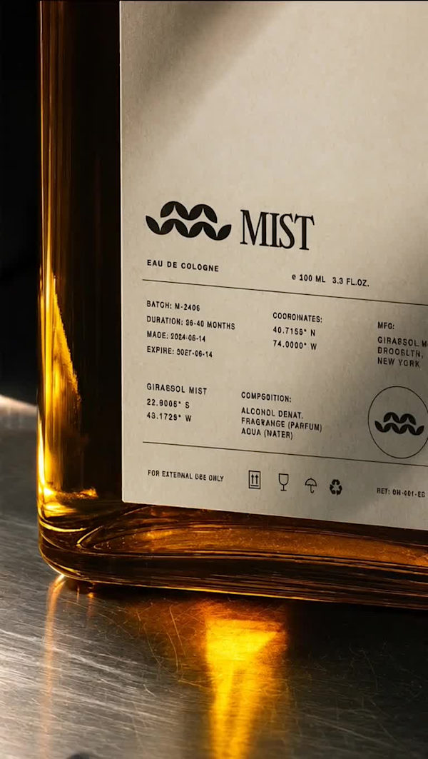
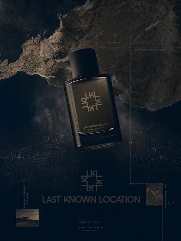
A fragrance brand that had no interest in looking expensive. I built MIST around the opposite instinct: strip every maison cue — the crest, the foil, the French flourish — and let restraint do the convincing.

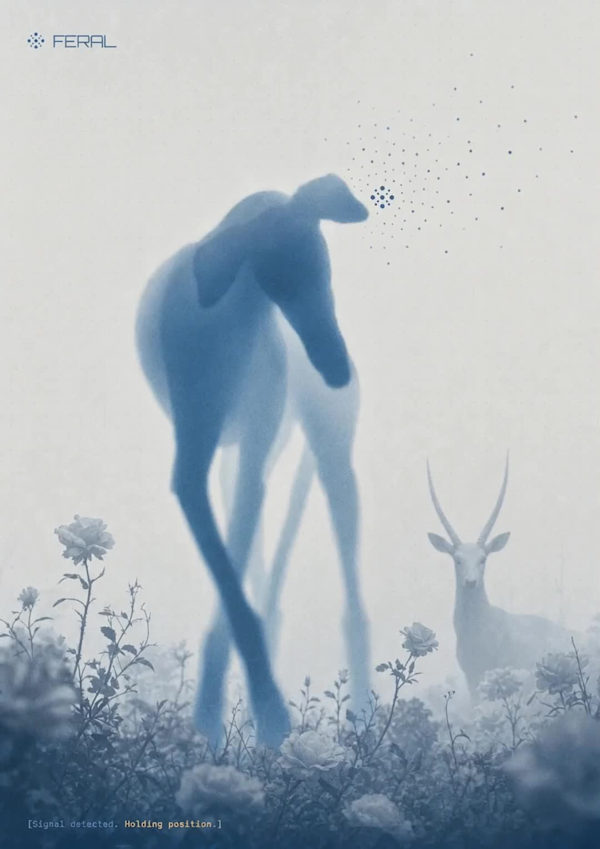
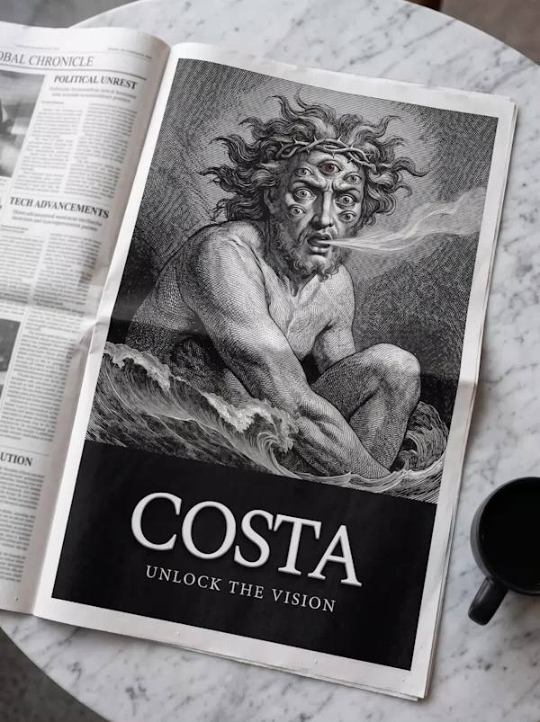
An AI interface brand that had no business looking calm. I built FERAL around a single idea: intelligence that works like a pack, not a single obedient assistant — and let a photograph of an antelope's eye carry more authority than any d…
Not an app. Not an agency. A network of people who know the way.

A fictional beauty brand built on a single idea: skincare treated like a specimen you inherit, not a product you buy. I started in illustration and ended in film photography, and the brand got more confident every time I let go of an ide…

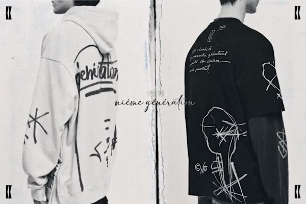
nième génération — a brand built on the idea that nothing arrives clean anymore

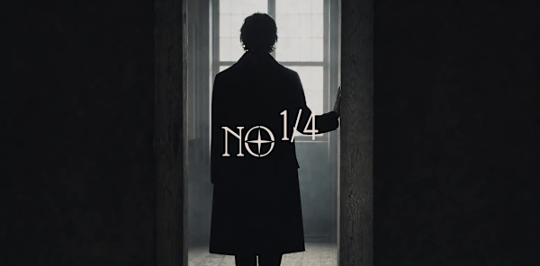
A crypto brand built on the pirate code, but not the pirate costume. I spent two full creative directions figuring out that what actually reads as dangerous isn't the boarding action — it's the stillness right before it.

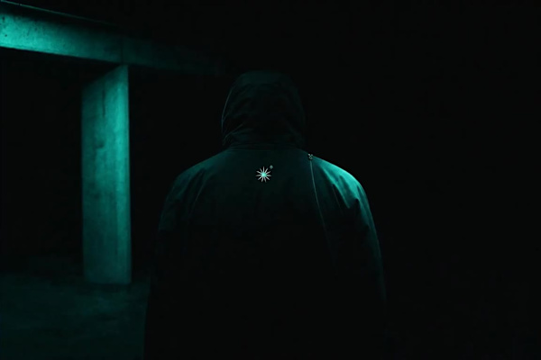
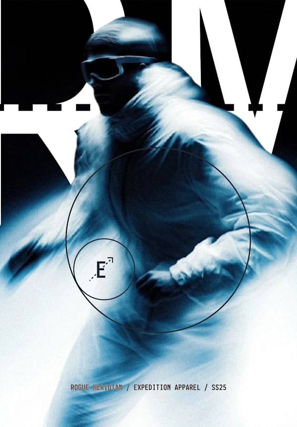
A technical apparel concept that refuses the entire visual language of outdoor achievement — no summits, no golden hour, no conquest. Just the threshold, the waiting, and the light of something that hasn't happened yet.

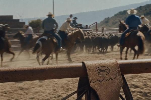
A premium riding house that didn't want to sell tradition. It wanted to sell instinct. I built Crin around one idea: a horse before anyone puts a saddle on it.

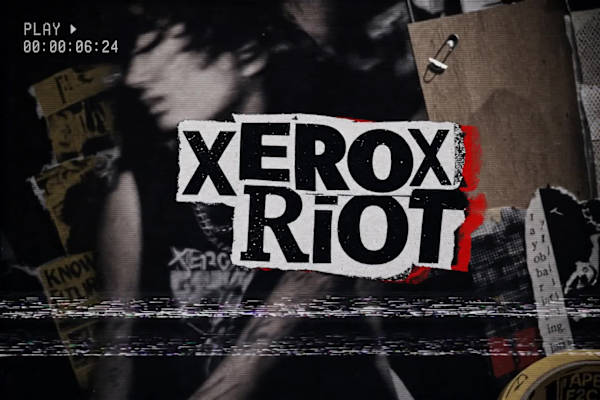
XEROX RIOT — A Brand Built to Look Like It Survived Something

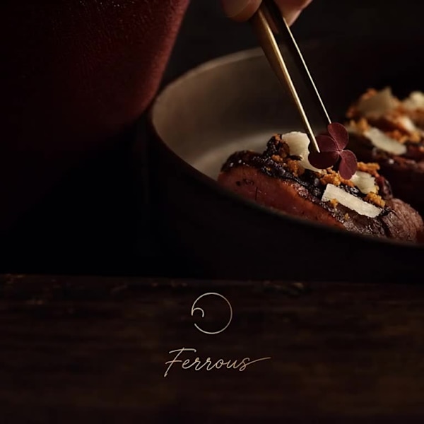
FERROUS — Cookware Built From What's Behind the Pass, Not On the Table

A hardware wallet brand for people who don't want to be sold to. I took the aesthetic restraint of Paradigm and Linear and pointed it at the one product category that never stops shouting — crypto hardware — to see what self-custody look…

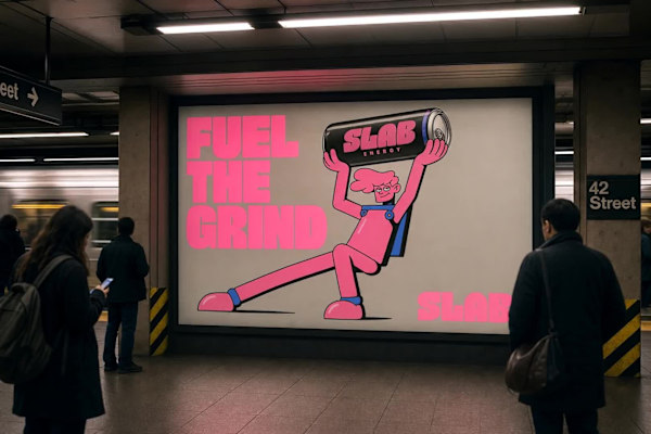
An energy drink brand needed to stand out in a category that's either all neon-gamer-chaos or all clean-girl-minimalism. I built the whole identity around a single collision: raw poured concrete and a giant, loose-limbed cartoon that loo…

A print studio brand built on the idea that warmth doesn't come from polish — it comes from the half-millimeter where the plates don't quite line up.
I wanted a portfolio brand that didn't apologize for the mess. Most self-branding chases polish. I built one around failure as the actual subject — a portfolio that treats every corrupted file, every broken render, as something worth kne…

A nutrition brand for people who find wellness branding condescending. I stripped out every soft edge the category relies on and built the identity like load-bearing infrastructure instead.
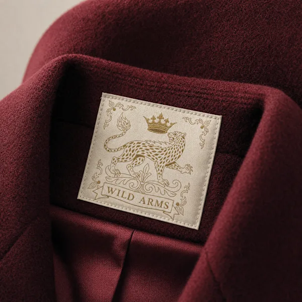
A heritage fashion house that never existed, built on one premise: what if the crown didn't fall to revolution, but to instinct. I designed the full identity, crest, and campaign for a brand whose nobility comes from bloodline, not burea…

A couture concept built on a rule I stole from a parlor game: three designers build one garment, none of them see what the others are doing. I designed the system that makes the collision look intentional.

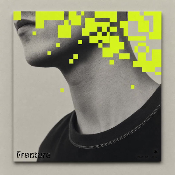
A SaaS brand built on the idea that data isn't corrupted, it's mid-render. I built an identity system where every photograph looks like it's being reconstructed in real time, one pixel-block at a time.

A climate infrastructure fund that needed to feel institutional without feeling inert. I built the entire identity around one tension: stone meeting forest. Ancient form, dissolving.
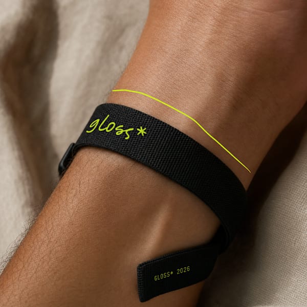
GLOSS* is a speculative lifestyle brand built on a single visual argument: the world is more interesting when someone draws on it. The entire identity system is constructed around two simultaneous registers — documentary photography and…
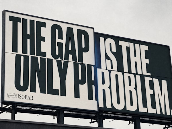
A SaaS brand for people who live inside the gap between data and the decision that depends on it. The brief was simple and impossible: make financial infrastructure feel like the air pressure before a storm — something you don't see unti…

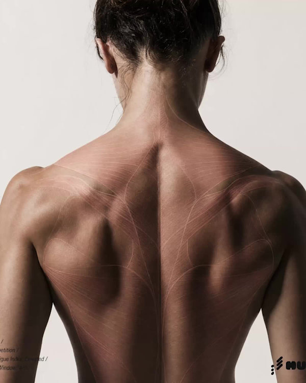
A recovery app brand built on the premise that the body is not a machine to be optimized — it is a specimen to be documented. Designed for athletes who want data, not motivation.
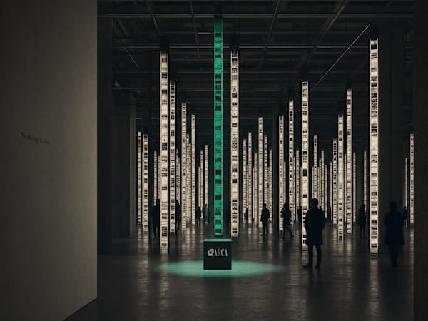
ARCA — The Archive Is Alive A DAM platform for creative studios that didn't want to feel like software. The brief was infrastructure. The answer was an institution.

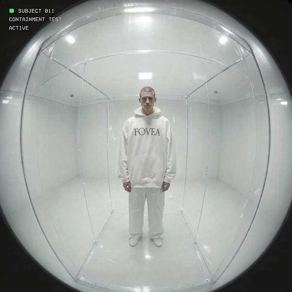
Most fashion brands want to be seen. FOVEA was built on a different premise: what if the brand was the one doing the looking?
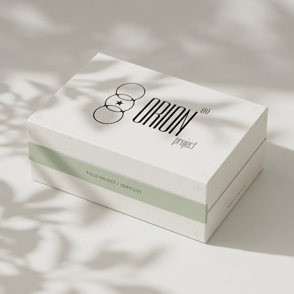
Brand Identity — Case Study Archive Edition 01 ORION-REF-001/A.01

A fictional Web3 protocol brand built entirely around the idea that the most important infrastructure is the kind nobody sees. No token iconography, no gradient, no hype. Thirty-plus outputs spanning identity, print, OOH, UI, physical ha…

A crypto protocol with no whitepaper aesthetic anywhere in sight. I took the mechanics of K-pop fandom — the parasocial pull, the drop culture, the obsessive loyalty — and built them into the visual language of a DeFi exchange.

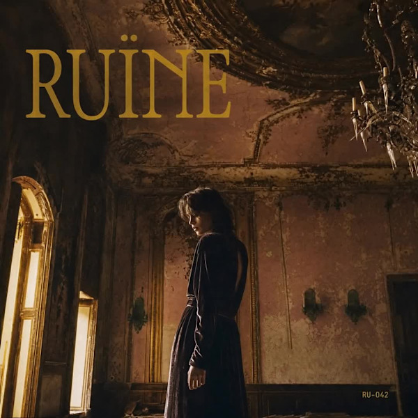
A music label built on one premise: prestige and decay are the same thing. No aspiration. No polish. Just the aftermath of something magnificent — and a visual system designed to live inside that gap permanently.

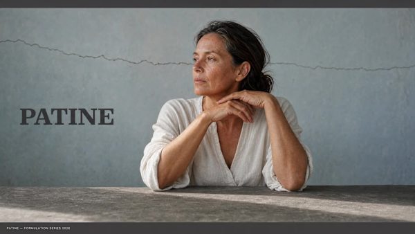
A beauty brand built on the opposite of every promise the industry makes. No reversal. No restoration. No glow. Just the honest intelligence of a surface that has been lived in.

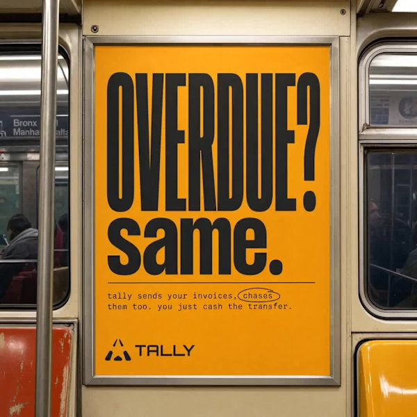
Tally — Brand Identity, Product Design, Campaign & Website Financial tools for people who hate financial tools.

Révolté — revolte.designYear: 2026 Scope: Brand Identity, Logo Design, Typography System, Campaign Direction, Art Direction, Website Industry: Fragrance / Luxury / Conceptual Fashion

A robotics hardware brand built from a single premise: beauty is a byproduct of engineering, never the goal. The identity is a specification system. Everything in it functions or it gets cut.

A fashion house built around one idea: luxury hospitality still running after the guests are gone.

A luxury brand built entirely around one contradiction: the hardest material in the softest world.

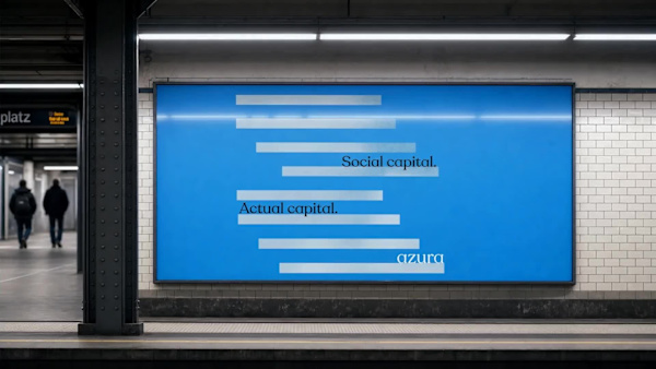
A web3 social brand built on the premise that every platform you've ever used profited from connections you built. AZURA makes those connections an asset — and the brand had to feel like something that had been inevitable all along.

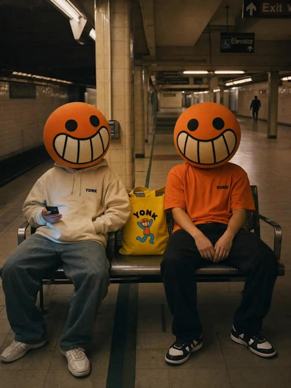
A gaming and entertainment brand built on a single bet: that the loudest, most joyful thing in the room wins. Not despite the cartoon. Because of it.

A supplement brand built to look like neither supplements nor branding. The brief was to create something for elite performers that didn't speak the language of the wellness industry at all.

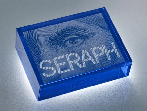
A web3 brand built on the oldest form of anti-counterfeiting technology — the engraving — and the most disposable aesthetic of the digital era — Y2K translucent plastic. The collision between those two things is not a stylistic choice. I…
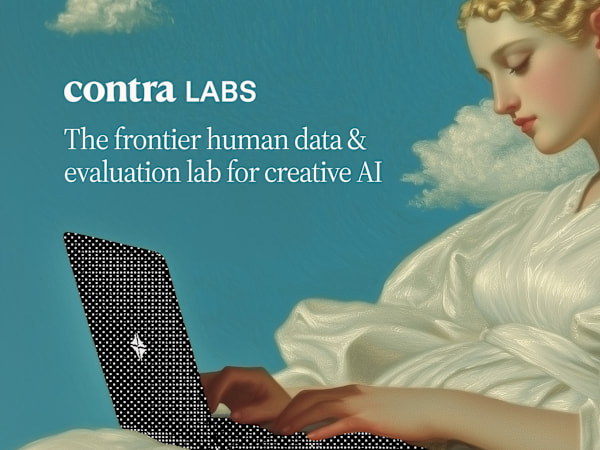
Contracted by Contra Labs to evaluate the visual fidelity of AI-generated graphics across 80 unique prompts, each producing 4 distinct outputs. The assessment focused on three core dimensions:

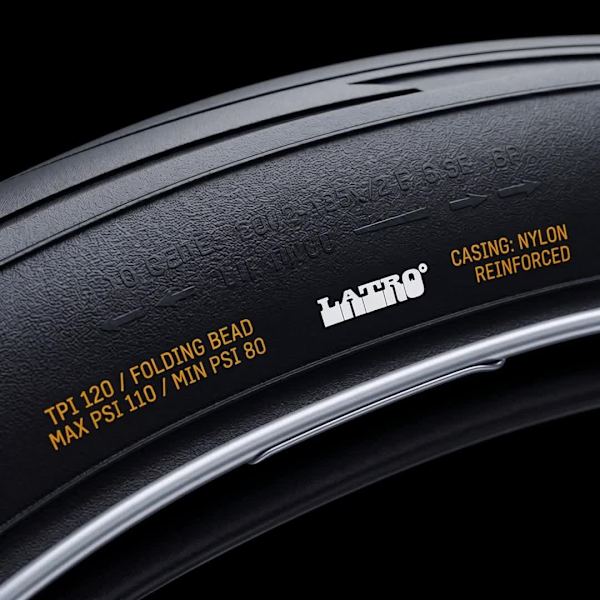
A brand for urban cyclists who treat their commute the way an engineer treats a load-bearing structure. No lifestyle. No athlete posing in golden hour. Just specs, tolerances, and a cityscape that doesn't care how you look moving through…
A productivity tool that needed to feel like the last photograph in a box you'd almost thrown away. Not a notes app. Not an AI dashboard. Something closer to the texture of how thinking actually feels — incomplete, sensory, layered, and…

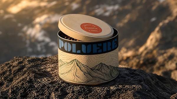
A specialty coffee brand built on one obsession: knowing exactly where your coffee comes from, down to the altitude, the farm, and the harvest date. The identity had to make that traceability feel like an adventure, not a data sheet.

A diagnostic platform that needed to look as certain as the data it returns. No reassurance. No wellness softness. Just measurement, rendered with the precision of the instruments that make it possible.
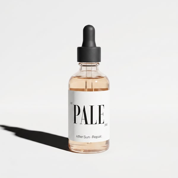
A sun care brand built on a single premise: protection doesn't need a lifestyle. It needs to be right.

Remote onboarding was being treated like a checklist problem. The real problem was that new hires had no sense of arrival — no moment where the company said: you're here, and here's what that means. Onbrd needed to be the brand that chan…

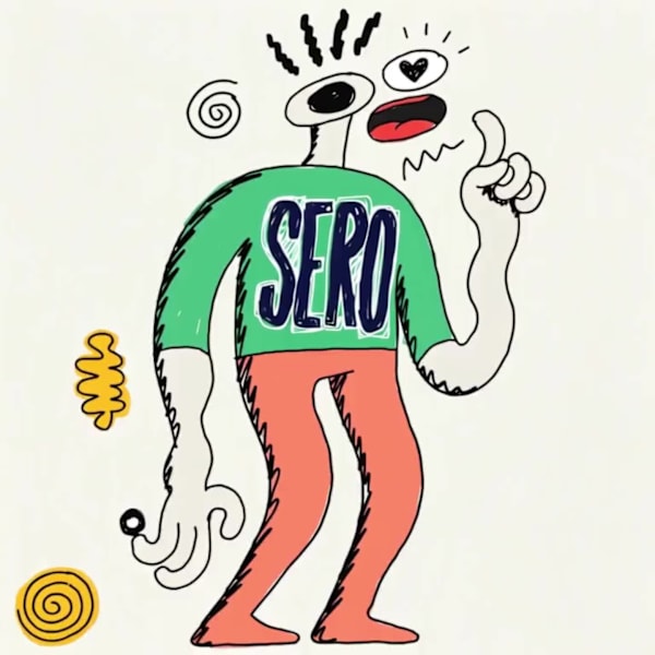
A mental health brand built around emotional precision — not comfort, not positivity, not the usual visual language of wellness. The answer was a character that doesn't smile on command.

A brand for people who plan obsessively, then abandon the plan. One mark. One conceptual tension. A complete system built around the moment the route ends and instinct begins.

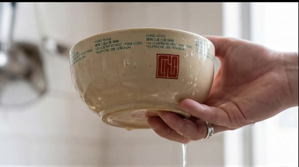
A pan-Asian street food brand that didn't want to be romanticized. The brief was to build something that felt like it had always existed — not a brand built around heritage, but one that looked like it had simply been documenting it for…
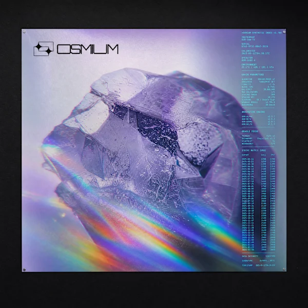
A DeFi derivatives brand built from the wrong material entirely. The brief was on-chain synthetic assets. The answer was geological specimens dissolving into live order books.
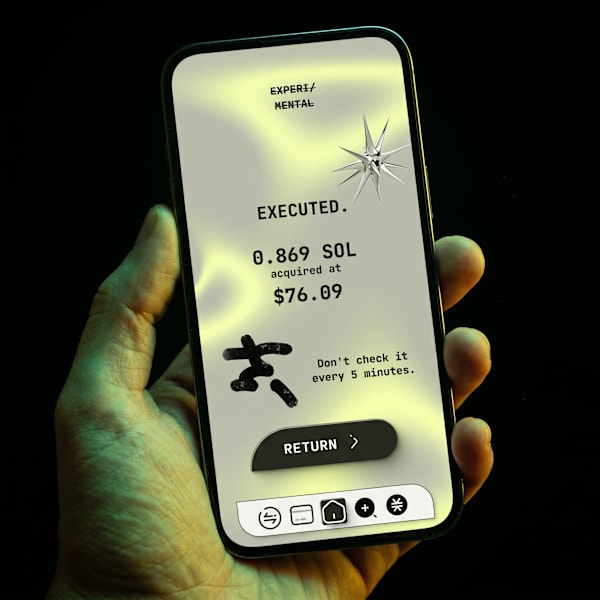
A speculative crypto wallet built for the DeFi-native user who's bored of blue-gradient fintech. The answer wasn't a better interface — it was an honest one.

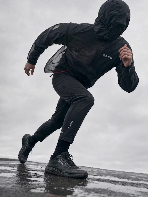
A technical apparel brand built for athletes who train in private. No faces, no manifesto, no story on the hangtag — just the weight of the fabric and one red cord.

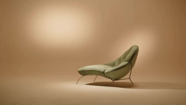
A Milano-rooted interior objects brand that needed to feel permanent before it had a history. The answer was one mark, one rule, and the discipline to use nothing else.

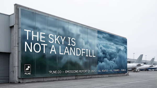
An aviation logistics brand that refuses to hide its emissions. The brief was radical transparency. The answer was a visual system that looks exactly like what the company does: files, manifests, data — made public.

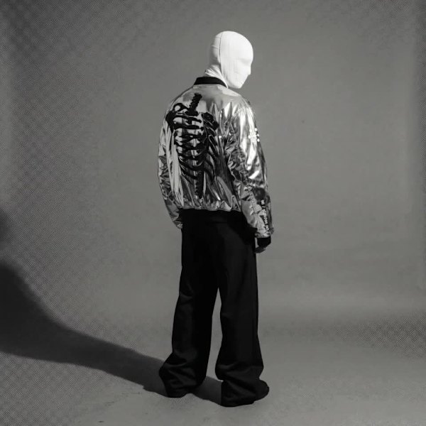
A streetwear brand built around a single idea: the body as the last honest system. Chrome, bone, organism, and glitch — identity design for Chrome Slick, Season 01.

A communications platform for executives who can't afford to be second. The brief was to build a brand that felt like the room you go to when everything else has failed.

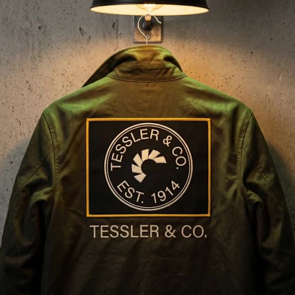
Tessler & Co. is a fictional tools and artisan brand built around a single conviction: things should be made to last, and when they don't, they should be repaired. In a market saturated with disposable products and seasonal refreshes, th…

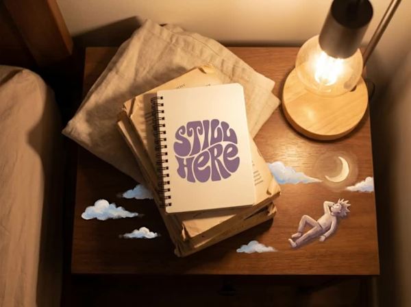
Still Here is a mental health and self-help brand for adults built on a deliberately disarming premise: that the most honest emotional language is the one we learned before we learned to hide. The brand uses the visual vocabulary of chil…

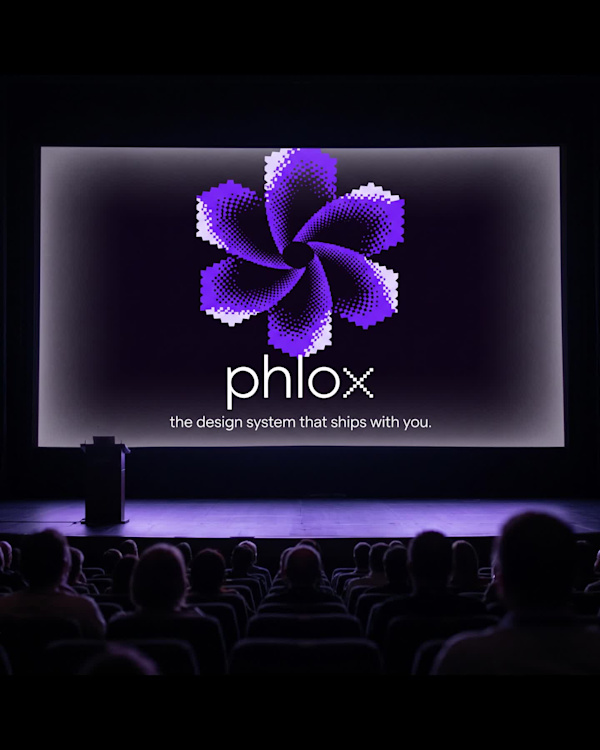
A design system tool that needed to feel like what it does: something precise and alive at the same time. The answer was a flower built from pixels and halftone dots — something that resolves into beauty from a distance and into data up…

A brand built for the hours between midnight and 4am, when the world is quiet enough to actually think, and the only light in the room is a reading lamp.
A brand for people who travel the way most people read — obsessively, slowly, over years. The whole system built from one mark that doesn't ask for permission.

An AI research platform that needed to feel like it had always existed. Not a tech product. Something older. Something that knew things before you asked.
A Japanese whisky import brand that needed to exist in two worlds simultaneously. The answer wasn't to balance them — it was to find the one object that already did.

A self-initiated brand identity for a fictional private tennis club. Two colors, one custom wordmark, fifteen touchpoints. No sport iconography. No heritage performance.

A productivity brand built for the people the morning has always ignored. The challenge wasn't designing an app — it was designing a lifestyle that already existed but had no name.

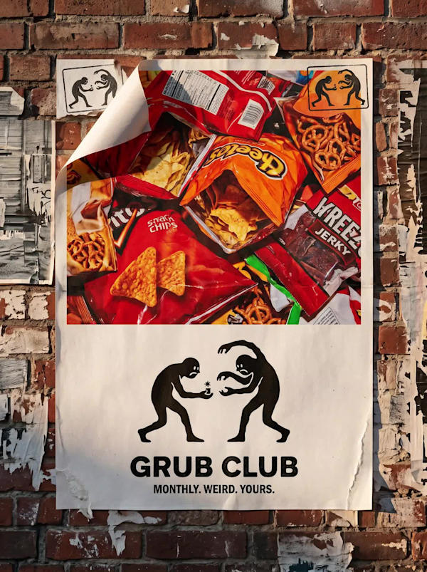
A brand for chaotic eaters built around a single confrontational image: two ink figures fighting over the thing between them. Not a food brand that celebrates nourishment. One that celebrates the fight.

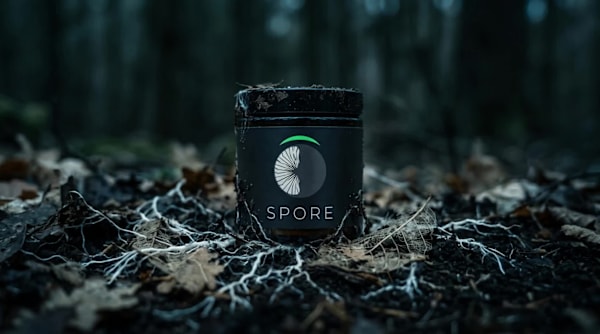
A functional mushroom supplement brand built entirely around biological strangeness. The brief was simple: no wellness theater, no soft beige, nothing that looks like it belongs next to a yoga mat. The answer was to treat fungi with the…
A Web3 infrastructure brand built for assets that matter. The brief demanded something the crypto space almost never produces: a brand that looks like it was already here before the money arrived.

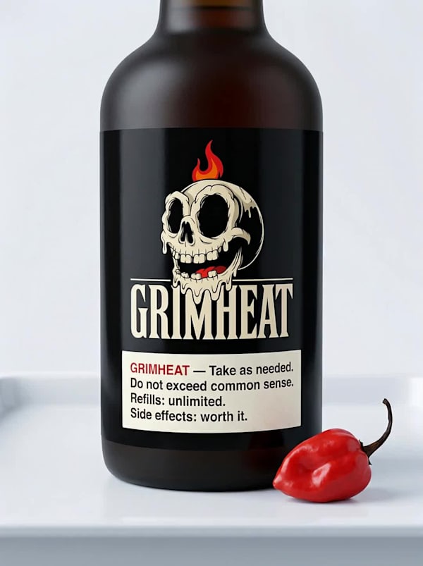
A hot sauce brand built from a single image — a grinning cartoon skull — into a full identity and three campaign directions, each designed to live in a completely different world.

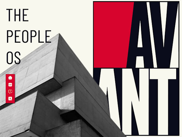
AVANT PEOPLE OS - Authoritarian Aesthetics for the Age of Work
A crypto wallet brand that treats precision as a philosophy — not a feature. Built for the user who already knows what they're doing.
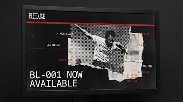
BLEEDLINE — Everything That Bleeds Past The Edge A brand identity and website direction for an independent music label built around the visual language of collage, newsprint, and the physicality of print.

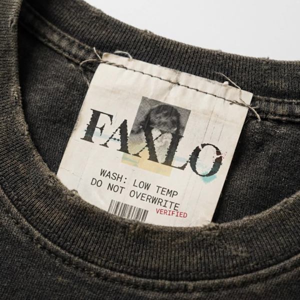
Faxlo is a high-fashion streetwear brand built on a single provocation: what if a receipt printer achieved consciousness?
A self-initiated brand identity built on a single premise: what if the Byzantine Empire never collapsed, and simply pivoted to artisan soap?
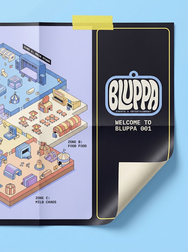
Events & Entertainment Brand Identity & Website Design Case Study

A security SaaS platform built from the forensic vocabulary it already lived in. No borrowed aesthetics. No consumer tech gloss. Just classified documents, severity codes, and a single rule: red means something.

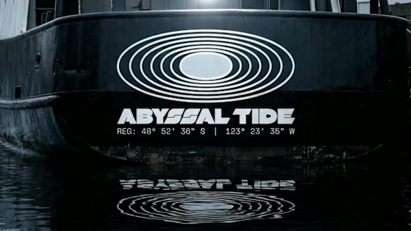
ABYSSAL TIDE is a precision aquaculture and sea farming brand built around a single conceptual tension: the ocean is calm on the surface and operating under forces so immense at depth that they are almost impossible to perceive until the…

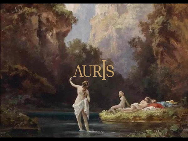
Auris is a financial wellness practice built on a single belief: that every person's economic life deserves the same quality of attention a Renaissance master gave to a subject. Not a bank. Not an app. A practice.

A healthy juice brand for people who are always on their way somewhere.

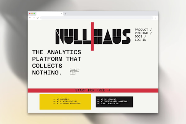
Brand Identity & Website / Privacy-First SaaS / Révolté / 2026
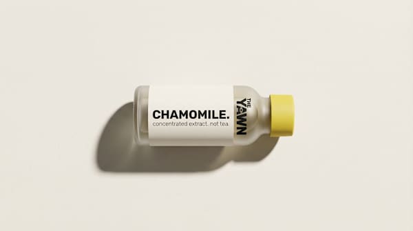
The Yawn is a minimalist sleep supplement brand built around a single, aggressive constraint: three products, three ingredients, nothing else. The brief called for a brand that could exist in the wellness space without speaking wellness…
VELA is a celestial fine jewelry brand rooted in astronomy, ancient navigation, and the poetic relationship between light and darkness. The brand was built from a single idea: jewelry as personal cosmology — not ornament, but meaning. Ea…
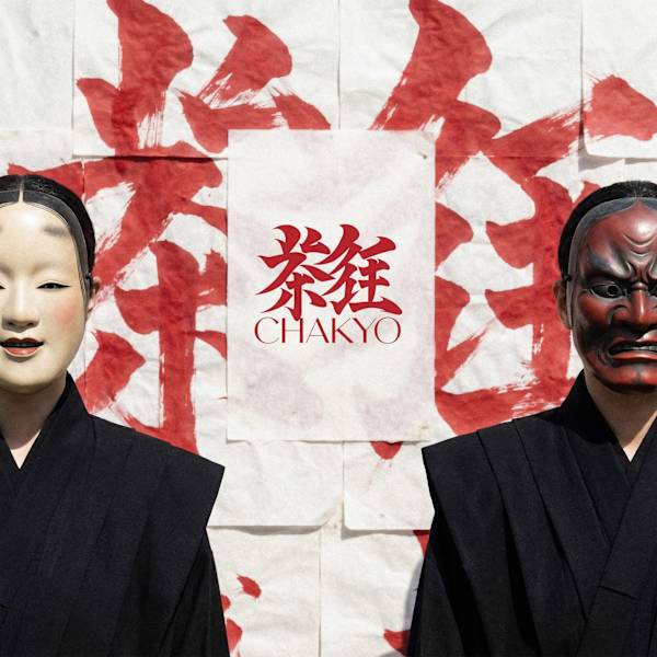
CHAKYŌ — 茶狂 BRAND IDENTITY CASE STUDY Japanese Tea. No Mercy.
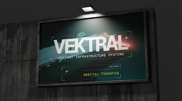
VEKTRAL — FREIGHT INFRASTRUCTURE SYSTEMS Brand Identity + Interfaces Case Study
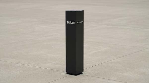
Sōlum is a sustainable architecture and urban planning firm that designs green infrastructure for dense cities — rooftop ecosystems, permeable streets, living walls. The brief was to build a brand identity from the ground up: one that co…

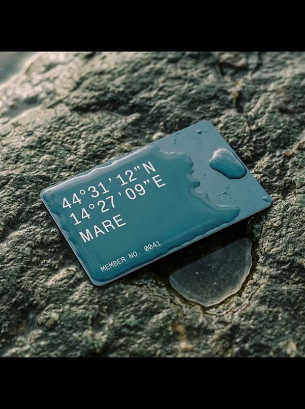
MARE — Brand Identity Discipline: Brand Identity, Identity System, Art Direction Deliverables: Mark System, Color System, Type System, Physical & Digital Applications, Photography Direction, Environmental Signage

Discipline: Brand Identity, Logo Design, Art Direction, Web Design Deliverables: Mark, Wordmark, Color System, Type System, Copywriting, Hero/Landing Design, Digital & Physical Applications
This is a self-initiated case study. A deliberate step outside my usual territory — brutalism, hypernoise, aggressive digital aesthetics — into something that required the opposite discipline: restraint, warmth, historical reference hand…
Build a SaaS brand for a contract and document intelligence platform. The product sits in a crowded, undifferentiated category — CLM software, document management, legal tech — where the visual language defaults to trust-blue, rounded co…
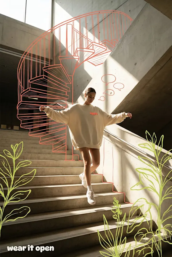
Kipple is a friendship-matching app — the social connection tool for people who've aged out of the easy, accidental friendships of school and into the deliberate, slightly awkward business of making new ones as an adult. The brief was to…

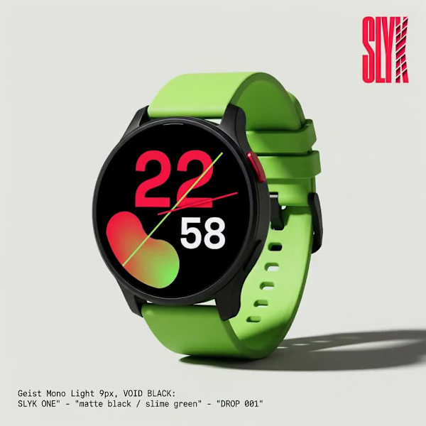
Brand: SLYK Category: Consumer wearable technology Positioning: Gen Z smartwatch brand. Customizable, drop-culture native, unapologetically loud. Tagline: loud by design. Deliverables: Brand identity, visual system, product design langua…
Révolté Year: 2026 Scope: Naming, Identity, Typography, Copywriting, Digital, Apparel, Collateral

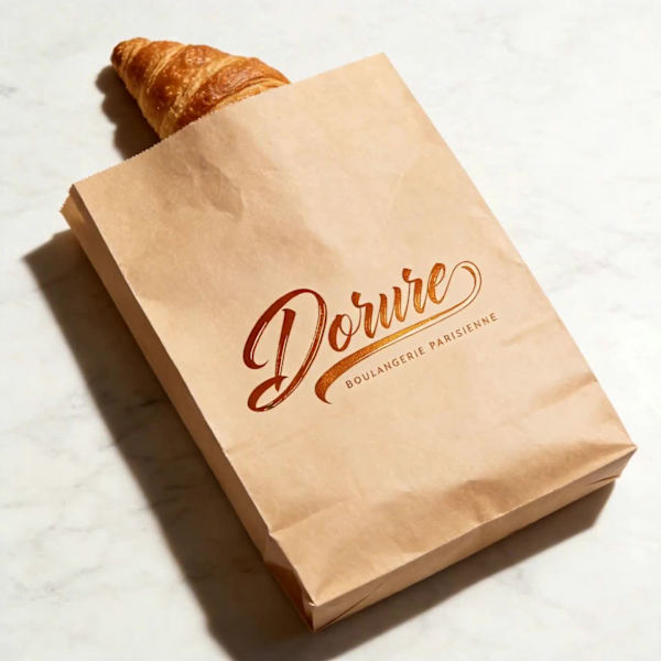
Dorure — Website and Brand Identity Case Study Year: 2025 Scope: Naming, Identity, Typography, Packaging, Copywriting, Digital
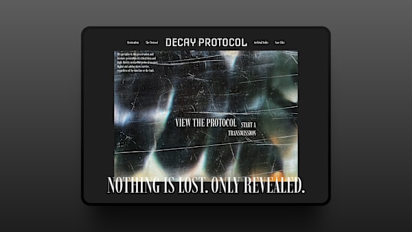
A film restoration and post-production studio needed an identity capable of holding two contradictory truths simultaneously: that deterioration is beautiful, and that the act of preserving something against entropy is a form of obsession…

Brand Identity, Motion, Print, Digital, Environmental, Apparel, Packaging, Hardware

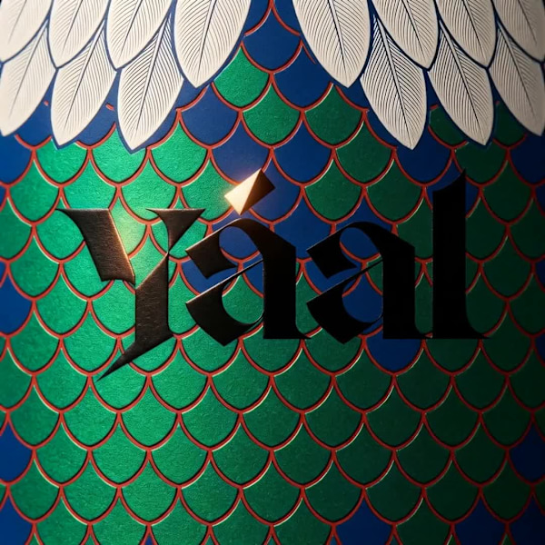
Yáal is an artisan mezcal brand built on a single visual argument: the geometry of pre-Columbian culture and the geometry of the natural world are the same system seen at different scales. The scale pattern on a quetzal feather and the s…
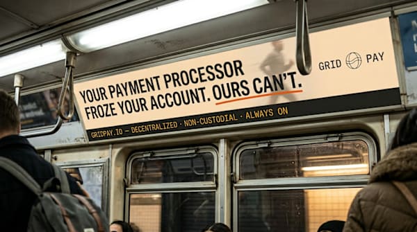
GRIDPAY is a Web3 payment processor built for businesses that don't ask permission to operate globally. Multi-chain, non-custodial, always on.
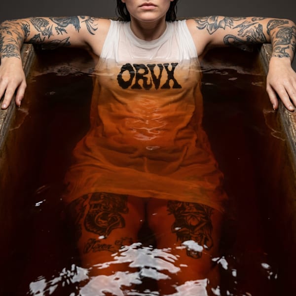
ORVX is a ready-to-wear fashion brand built on a single premise: the body wearing the garment is as important as the garment itself. Every campaign image treats skin, tattoo, and fabric as equivalent surfaces — none background, none fore…
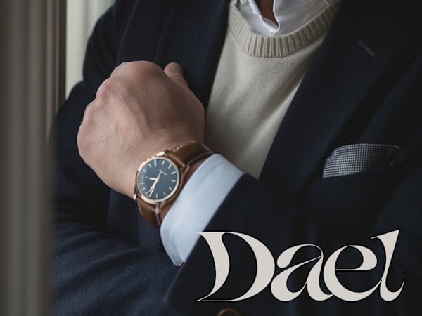
Dael is a watches and eyewear brand built for the buyer who finds most luxury exhausting. The brief was to develop a complete brand identity anchored in restraint — a calligraphic logotype, a palette drawn entirely from natural materials…

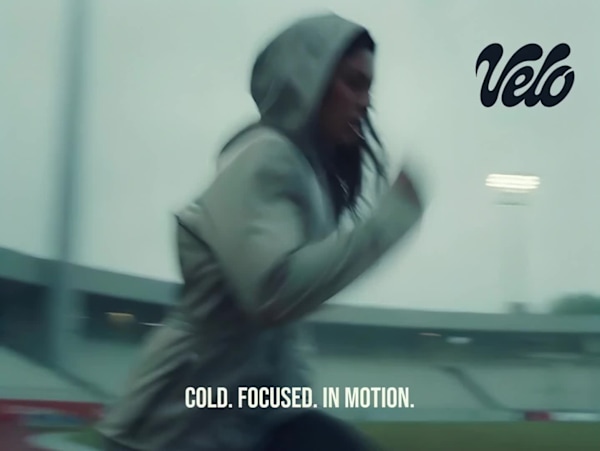
Velo is a health performance drink built for athletes who train before the world wakes up. The brief was to develop a complete brand identity from naming through to a deployable visual system — covering logo selection, palette definition…

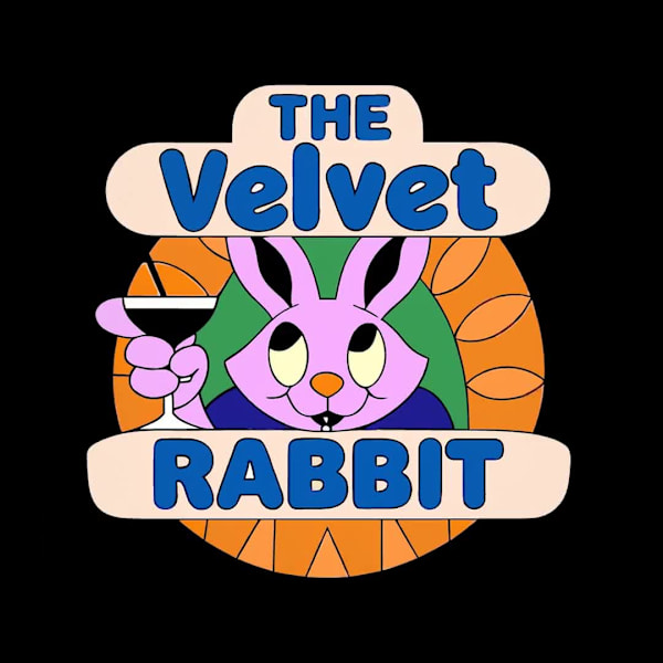
The Velvet Rabbit is a fictional speakeasy bar concept developed as a creative sprint. The brief was open-ended — a single phrase, "all roads lead to Rome" — and the challenge was to build a complete brand world from that starting point:…
Blendworks is an AI media generation platform designed for creative teams who value boundless creativity, ownership, and privacy. I developed a complete brand identity system from the ground up, creating a distinctive visual language tha…
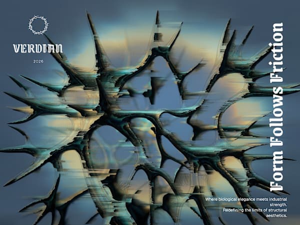
Veridian is a luxury design house that launched its seminal collection, "Liturgy of Iron," in early 2026. The brand bridges the gap between biological elegance and industrial strength, a philosophy defined as "Prophetic Structuralism." T…

I chose Canon because photography isn’t only about capturing the moment, it’s about what remains once it passes.
VOID-SPEC is a conceptual technical apparel brand and website built for "the intentional ghost." The goal was to create a visual identity that feels almost invisible yet architecturally indestructible, focusing on atmospheric protection…
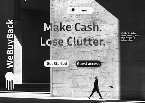
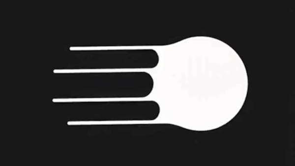
Full rebrand for WeBuyBack. The new logo utilizes a high-speed trailing effect to convey rapid movement and efficiency. By blending industrial minimalism with atmospheric motion, the brand now feels as fast as the service it provides.

Full rebrand for WeBuyBack( https://webuyback.in/) . The new logo utilizes a high-speed trailing effect to convey rapid movement. By blending industrial minimalism with atmospheric motion, the brand now feels as fast as the service it pr…
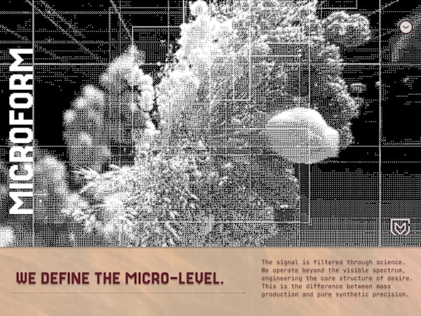
I completed MICROFORM between December 1-5, 2025, as a comprehensive branding and website project that pushed my boundaries in creating cutting-edge design aesthetics combined with analytics-focused functionality. I built this using Figm…
I started with designing this hero and the dithered abstract flower image, then I asked myself, why not build an entire visual system from scratch? It's all about the balance between data and nature. Guys, what are you working on?
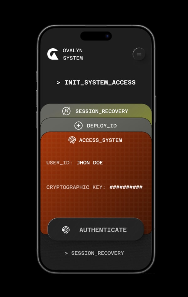
The OVALYN SYSTEM UI is a study in FinTech synthesis: high security meets premium access. We established a consistent visual language across all screens:
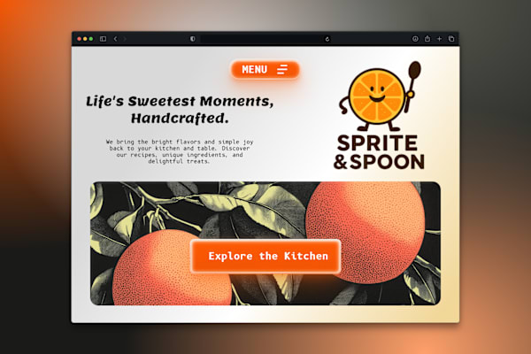
Designing the hero for Sprite & Spoon was all about contrast: marrying a minimalist, cartoon mascot with a rich, engraved citrus illustration. The goal was to keep the brand fun (friendly fonts, glowing buttons) while establishing a high…

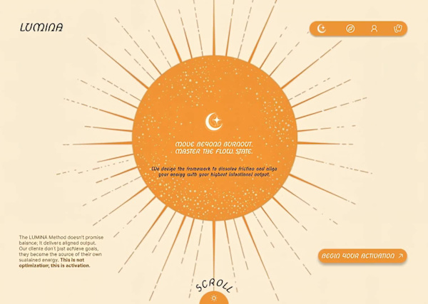
Just finished the animation for the LUMINA Hero section. The design centers on the glowing, animated sun to represent the source of sustained energy and aligned output.
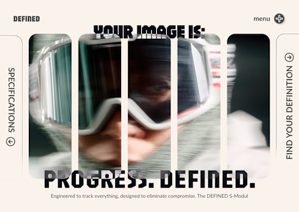
Analyzing the DEFINED S-Modul design. I used vertical slicing and subtle motion blur to fragment the focus, emphasizing the speed of the subject while using the bold, rigid text to ground the concept. A high-energy modular aesthetic.

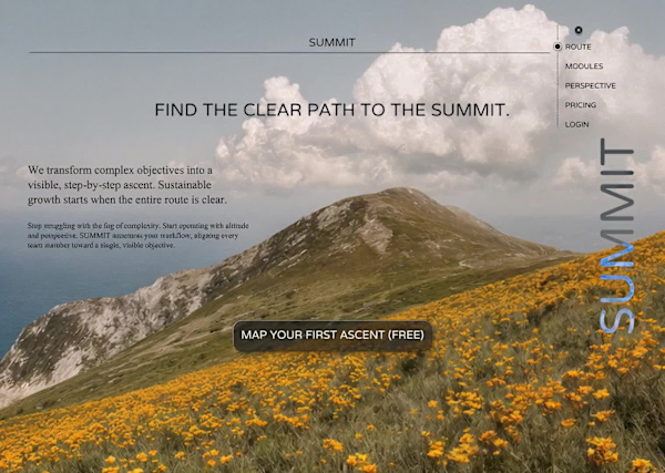
After the structural intensity of VORTEX, I wanted to end on calm: SUMMIT uses natural landscape to sell sustainable growth and perspective.

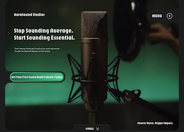
I focused this dark-mode design on one core idea: quality over noise. The headline "Stop Sounding Average. Start Sounding Essential." immediately defines the client's high-value service. The CTA is direct: Free Sound Audit. Clear voice,…
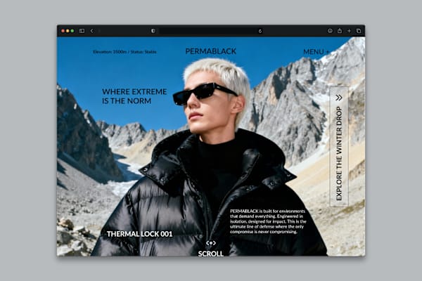
The challenge was translating technical luxury. I used the raw power of the mountain against the clean, uncompromising style of the jacket to define the brand: WHERE EXTREME IS THE NORM. It's about data-driven endurance and absolute aest…
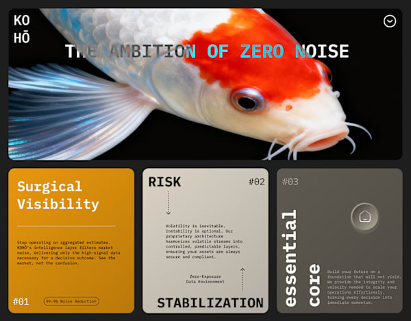
The visual challenge was translating high-stakes finance into surgical clarity. I used the Koi as a symbol of unwavering ambition and built the experience around THE AMBITION OF ZERO NOISE. The bento layout and typography reinforce the p…
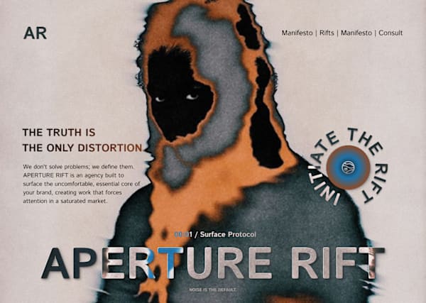
The challenge: Design a hero that feels unsettlingly essential. I used digital distortion and deep contrast to visualize the core belief: THE TRUTH IS THE ONLY DISTORTION. It’s not about finding comfort; it’s about forcing attention.
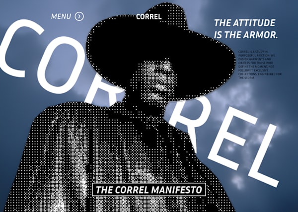
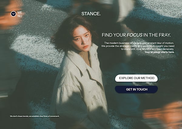
Swapping the expected minimalism for cinematic drama. This is the ultimate expression of the Editorial-Subversive style I develop for luxury brands. We used texture, pixelation, and aggressive typography to establish an identity of uncom…
This design illustrates my core approach: using powerful, editorial imagery and minimal type to convey complex strategy. Clients hire me to create this level of unique, conceptually-driven UI/UX that transforms a website into a statement.
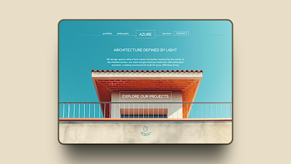
Designing for tranquility. The challenge here was using minimal text to match the clean geometry of the architecture. I used Fredoka for its soft, rounded geometry, which subtly counters the harsh straight lines of the building. It adds…
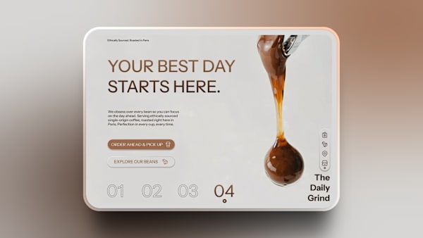
I really need a coffee, buti made this hero design for The Daily Grind that is all about visual anchors and trust.
I've been working on the UARA Health OS web design since September 2025 as an ongoing project for a SaaS healthcare client. This has been one of my most comprehensive design undertakings, combining graphic design, UI/UX, and web design u…
What happens when you change only the typography and text treatment of a brand while keeping everything else identical? This case study explores how font choices can completely reposition a brand's perception, target audience, and market…
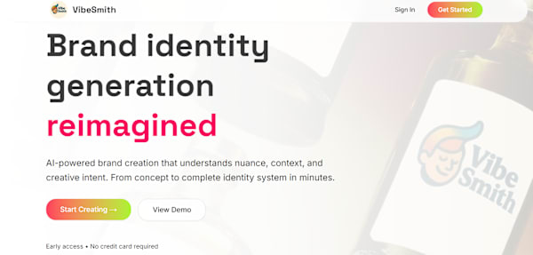
I worked on VibeSmith from August to September 2025 for a startup client, creating both the web design and development for an AI-powered brand identity generation platform. My goal was to create a clean, minimalist workspace that helps u…
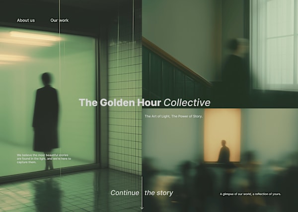
The Golden Hour Collective is a boutique photography and cinematography studio that specializes in capturing the ephemeral beauty of natural light and authentic human moments. More than a photography service, it's a creative collective d…
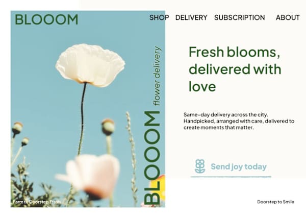
BLOOOM is a modern flower delivery service that bridges the gap between traditional floristry and contemporary e-commerce. The brand was created to transform flower delivery from a transactional experience into an emotional, memorable jo…
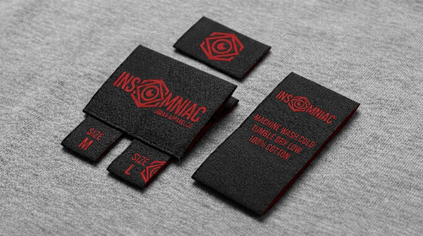
Insomniac is a streetwear brand built for the relentless—the creators, hustlers, and minds that refuse to shut off. Born from the culture of late-night grind and urban grit, Insomniac represents those who build their dreams in the darkne…
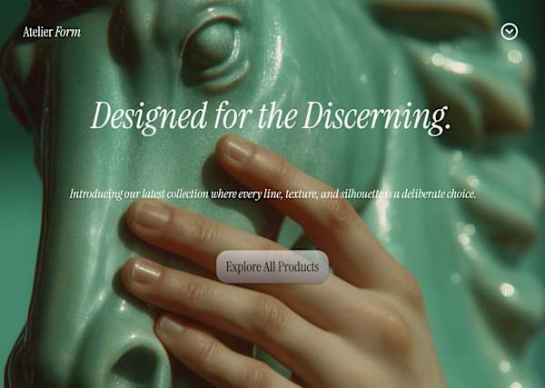
Atelier Form was conceived to represent the "Slow Art" movement within the photography industry. The goal was to create a visual identity that feels less like a commercial service and more like a curated, high-end gallery experience for…
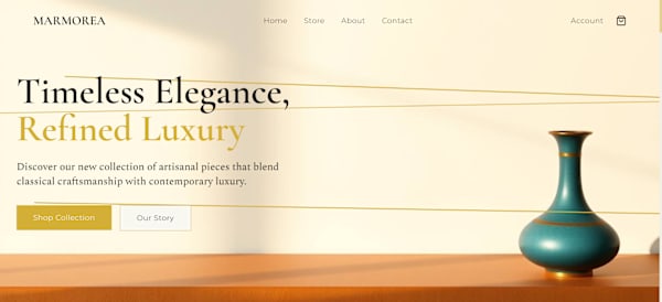
Brand Identity: Sophisticated, Timeless, Artisanal. Tech Stack: Next.js, Tailwind CSS, shadcn/ui. Key Themes: Kintsugi philosophy, ethereal minimalism, and light-play.
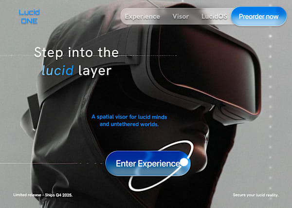
Lucid ONE aims to disrupt the spatial computing market by moving away from "toy-like" VR aesthetics toward a sophisticated, high-performance hardware identity. The goal was to market the visor not just as a gadget, but as an essential ga…
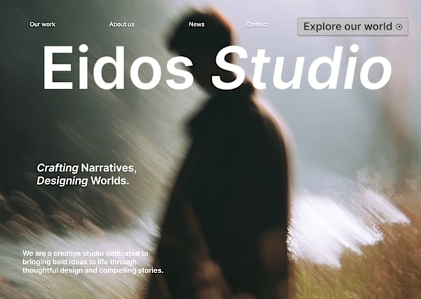
Eidos Studio is a conceptual photography studio focused on narrative-driven visual storytelling. The brand positions itself at the intersection of cinematic art direction and contemporary minimalism.